
SCROLL DOWN FOR MORE

ISLA PRIVATE RESIDENCES
DETAILS
Client: Chaimaa
Industry: Real Estate
Location: Dubai, UAE
Status
Launched
work
Advisory & Marketing Strategy
Place Visioning & Placemaking
Destination Brand Strategy, Positioning & Identity
Sub-brand Ecosystems
3D Visualisation
Brochureware
Digital Ecosystem
Lifecycle Marketing
Launch Campaign Development & Event
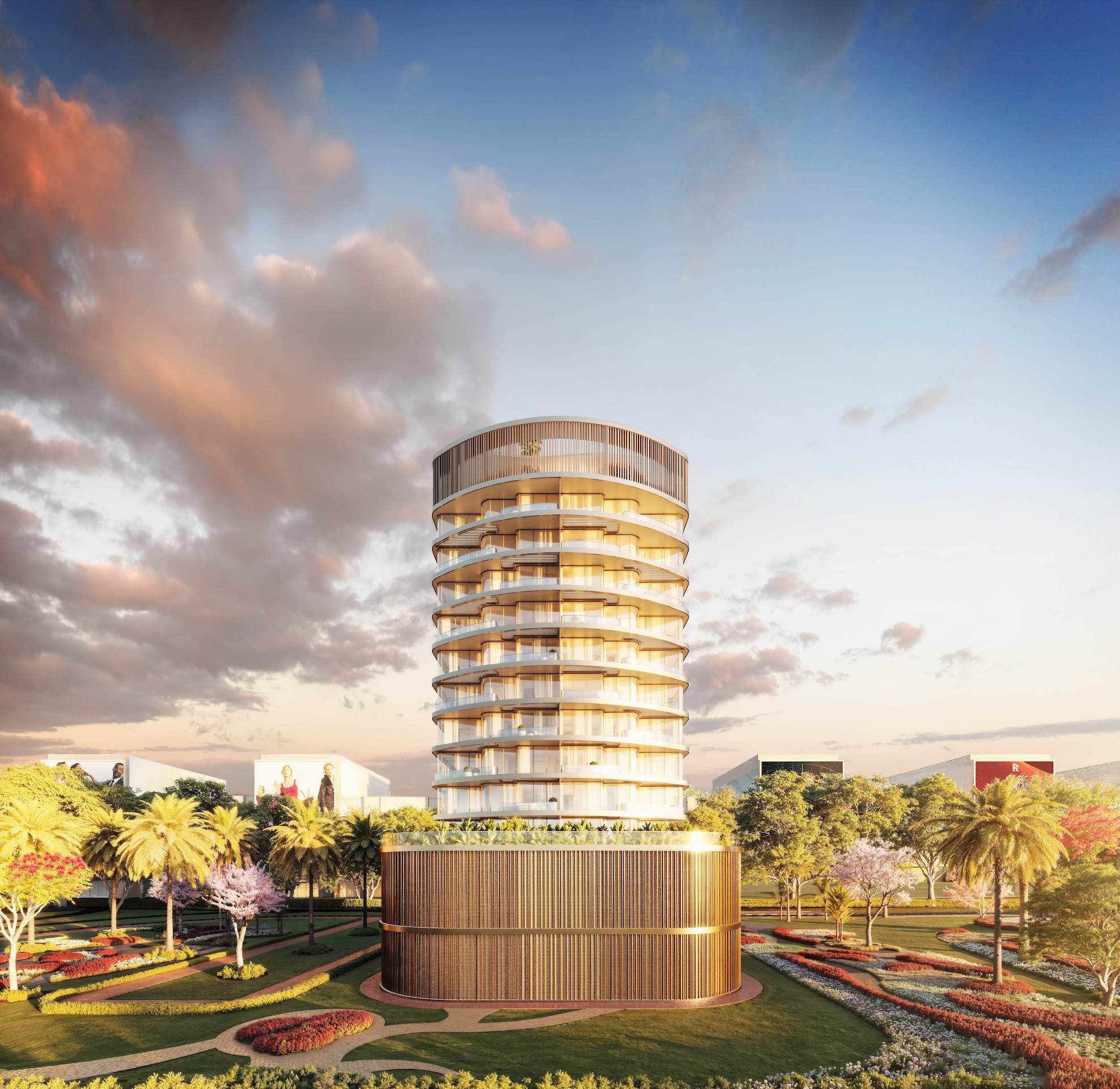
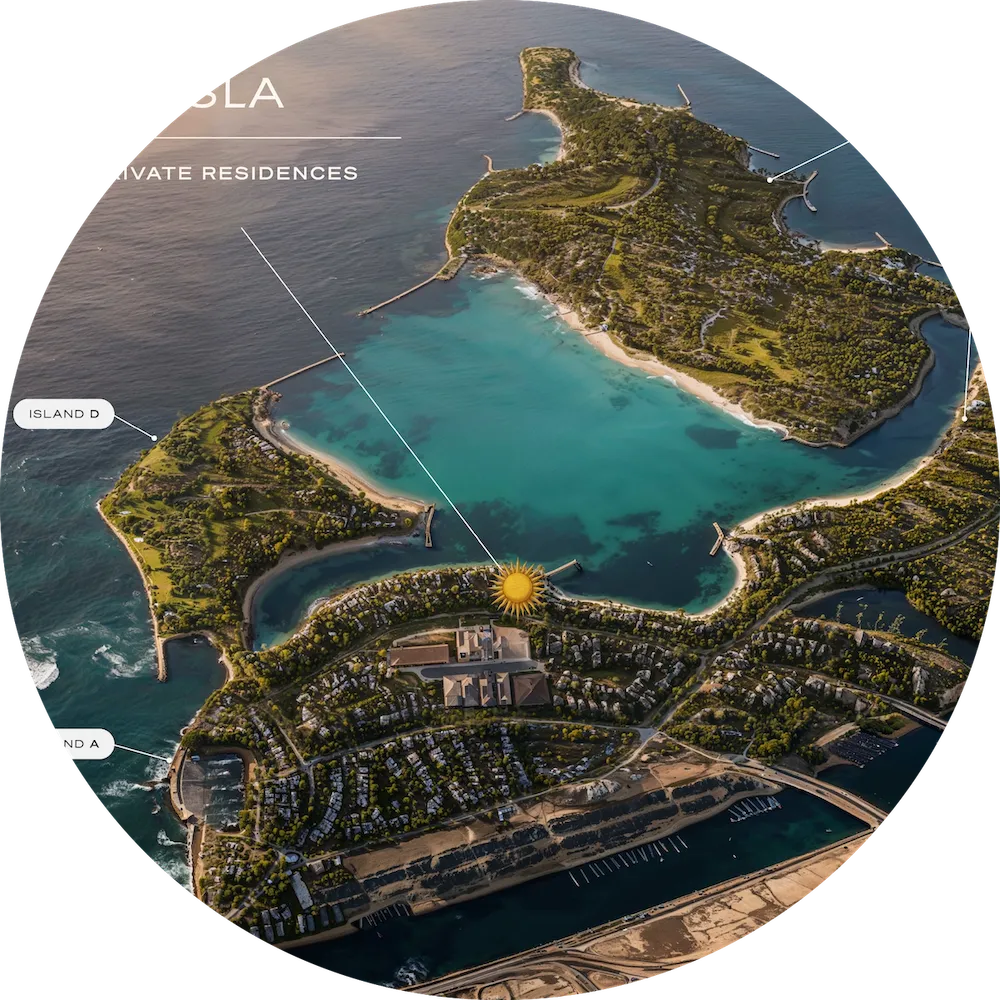
Every beachfront tower sells the same view. RUYA gave Chaimaa something else to sell: Dolce Far Niente, the Italian art of sweet idleness, built into 76 residences on Dubai Islands. RUYA built the positioning, verbal identity and visual language from scratch, then produced the photorealistic renders that gave the unbuilt tower its first public face. Featuring Cengiz Coşkun as the project's brand ambassador, RUYA extended his presence into a Dubai airport activation and a phased campaign that ran from teaser to launch.


CONTEXT & BACKGROUND
01
residential supply arriving at once, from established and emerging developers alike.
02
03
BRAND STRATEGY & POSITIONING
Brand Main Concept
DOLCE FAR NIENTE
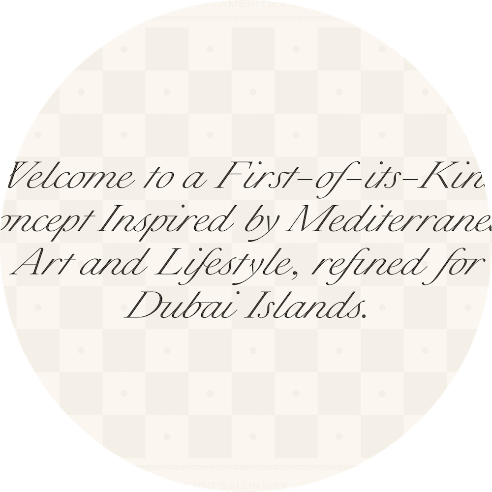
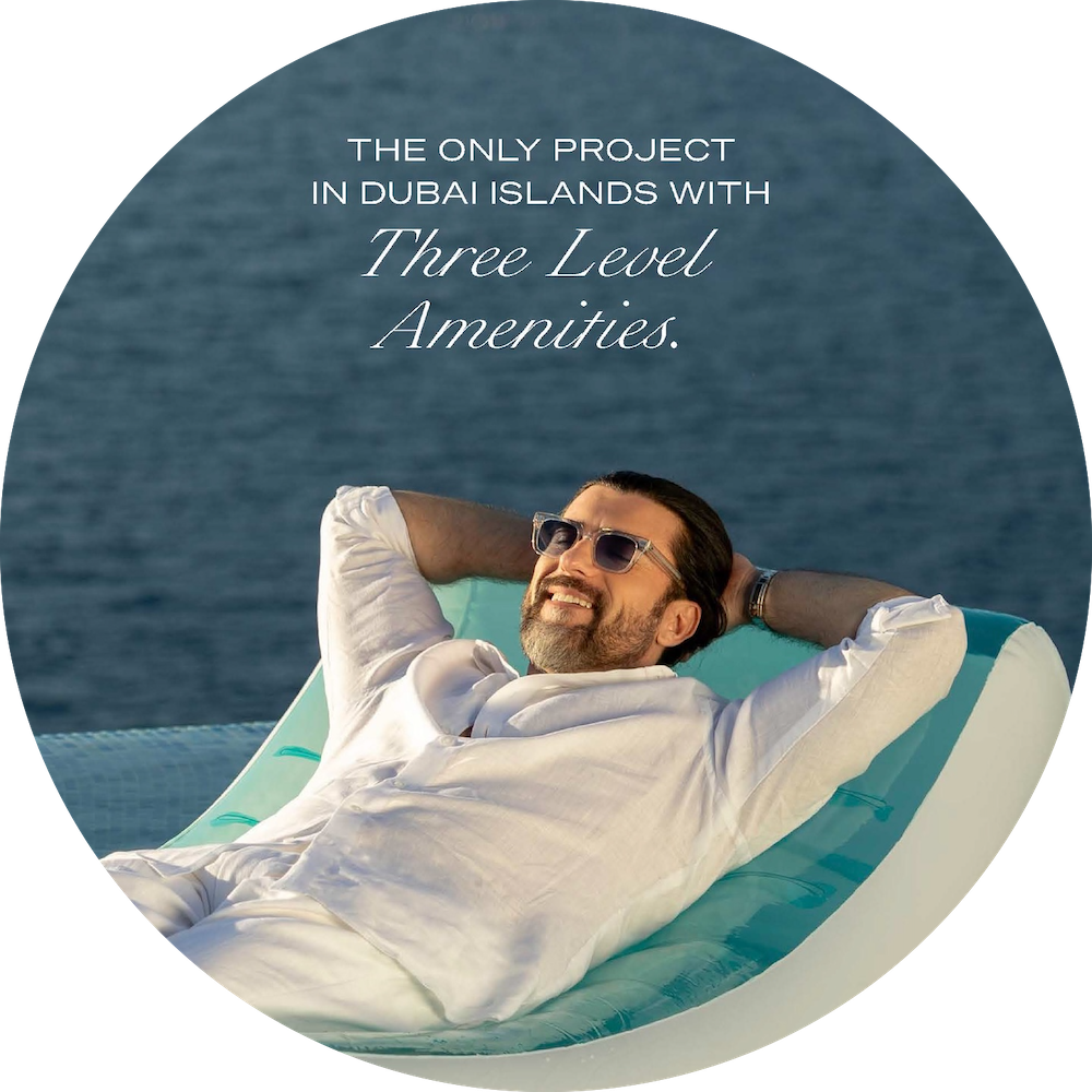
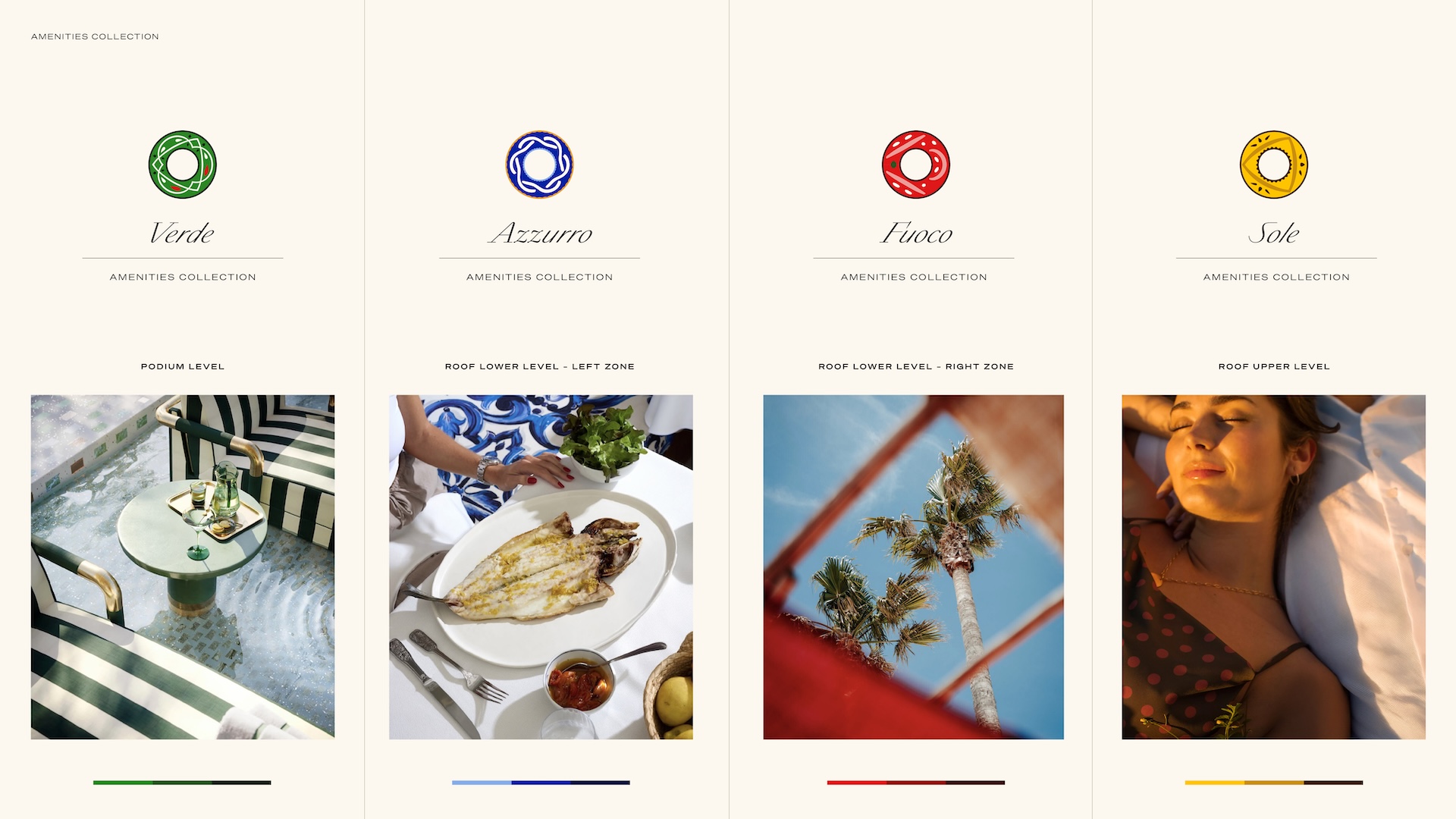
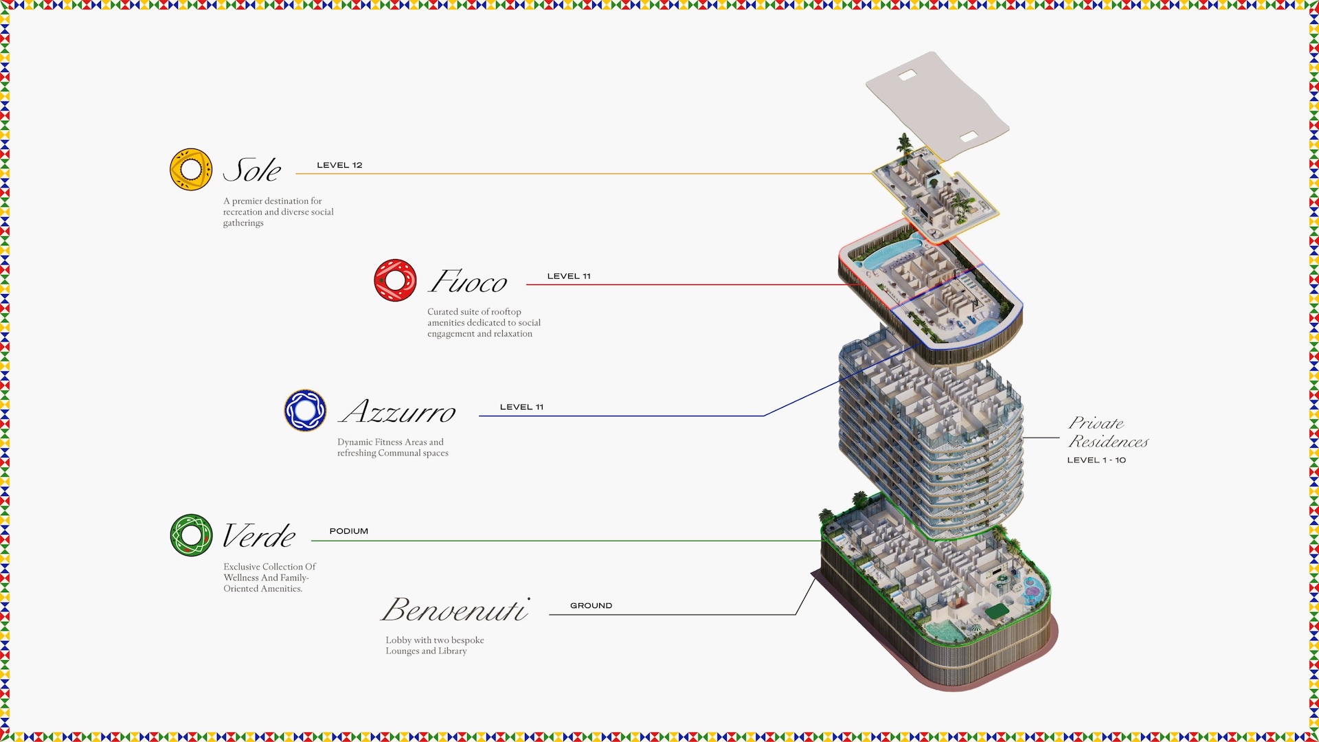
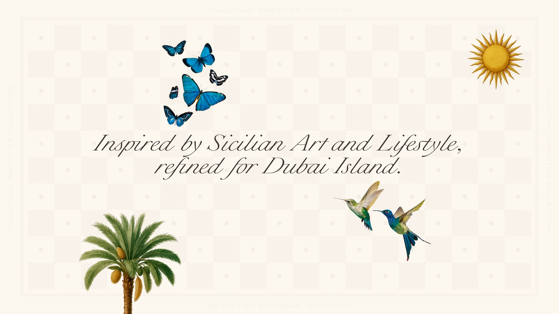
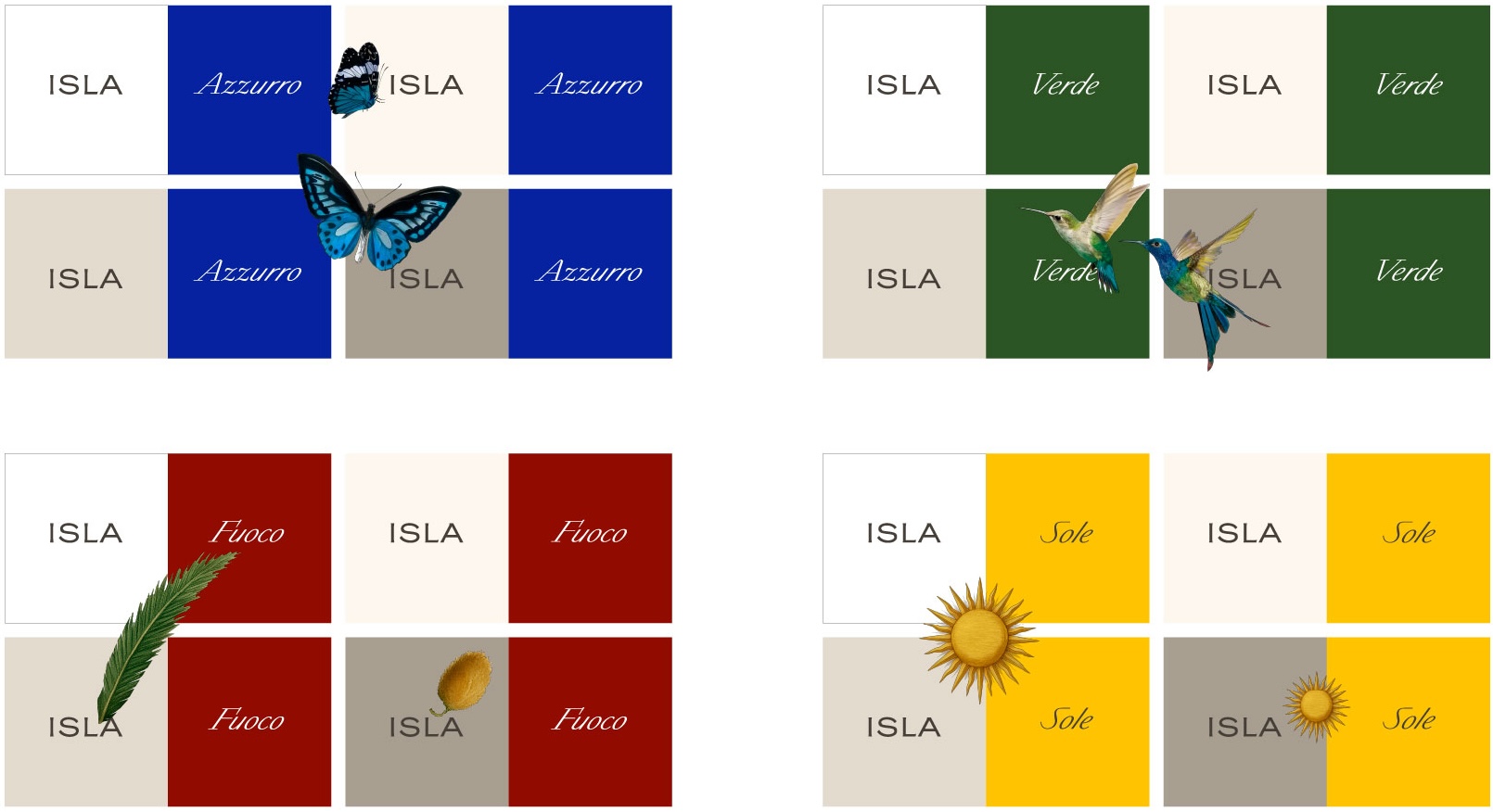
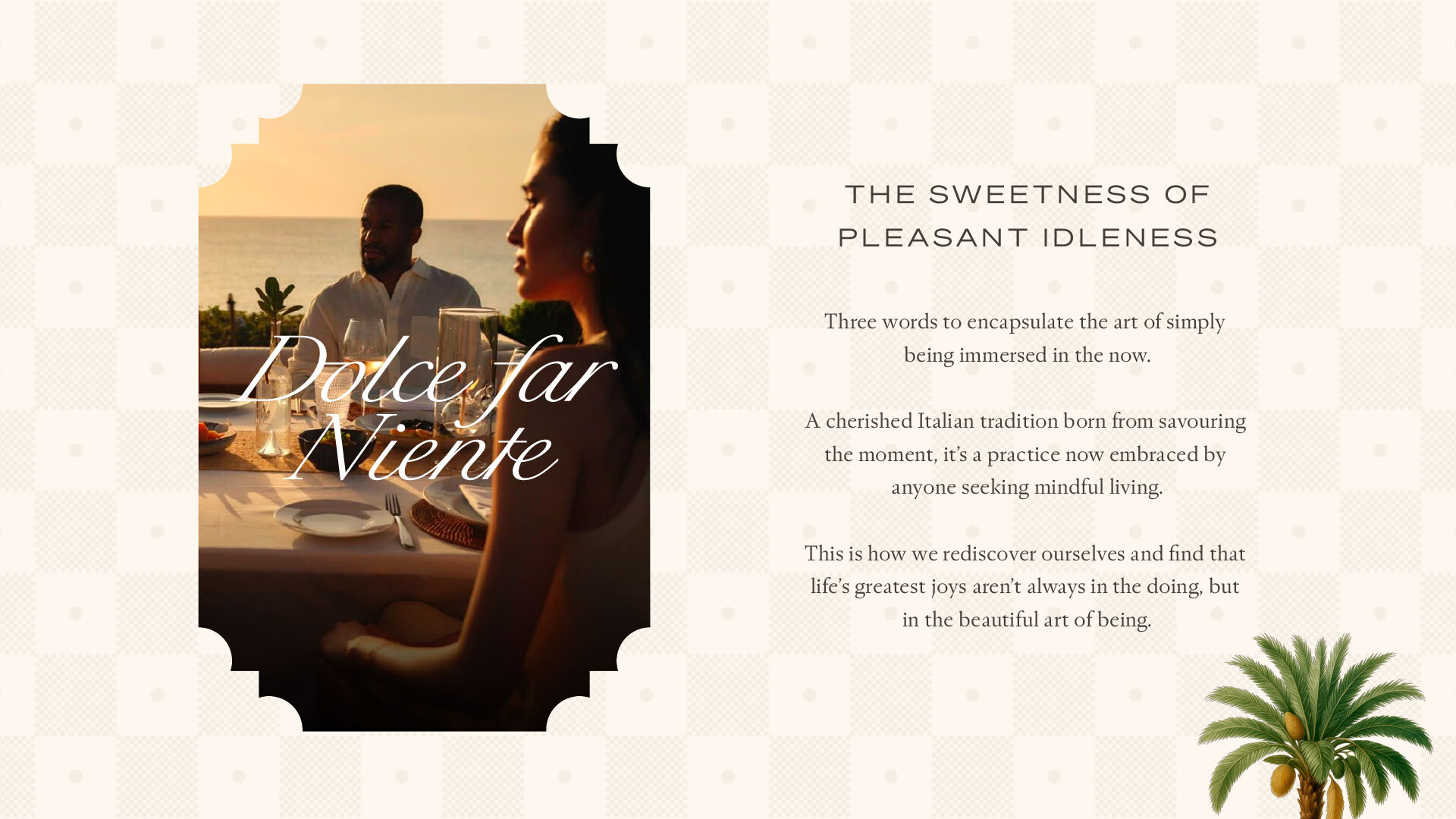
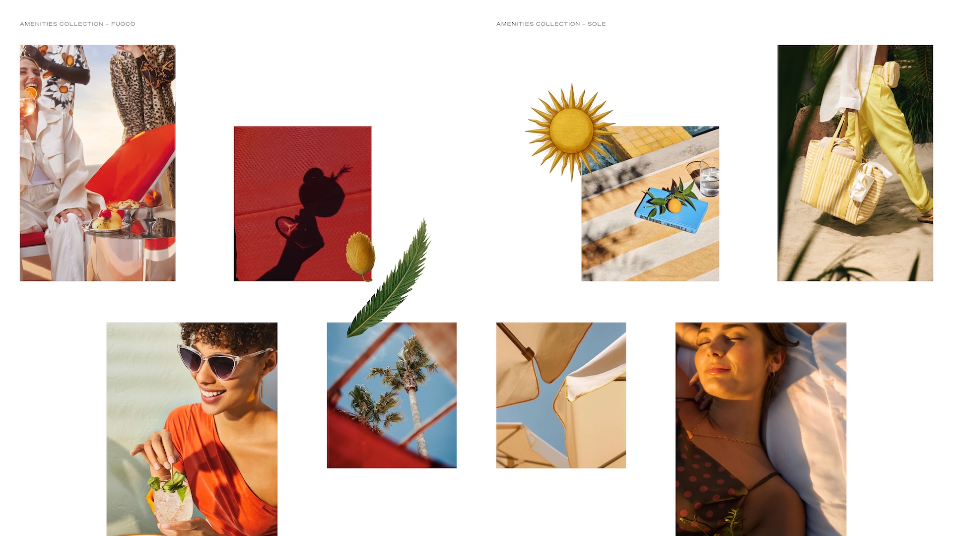
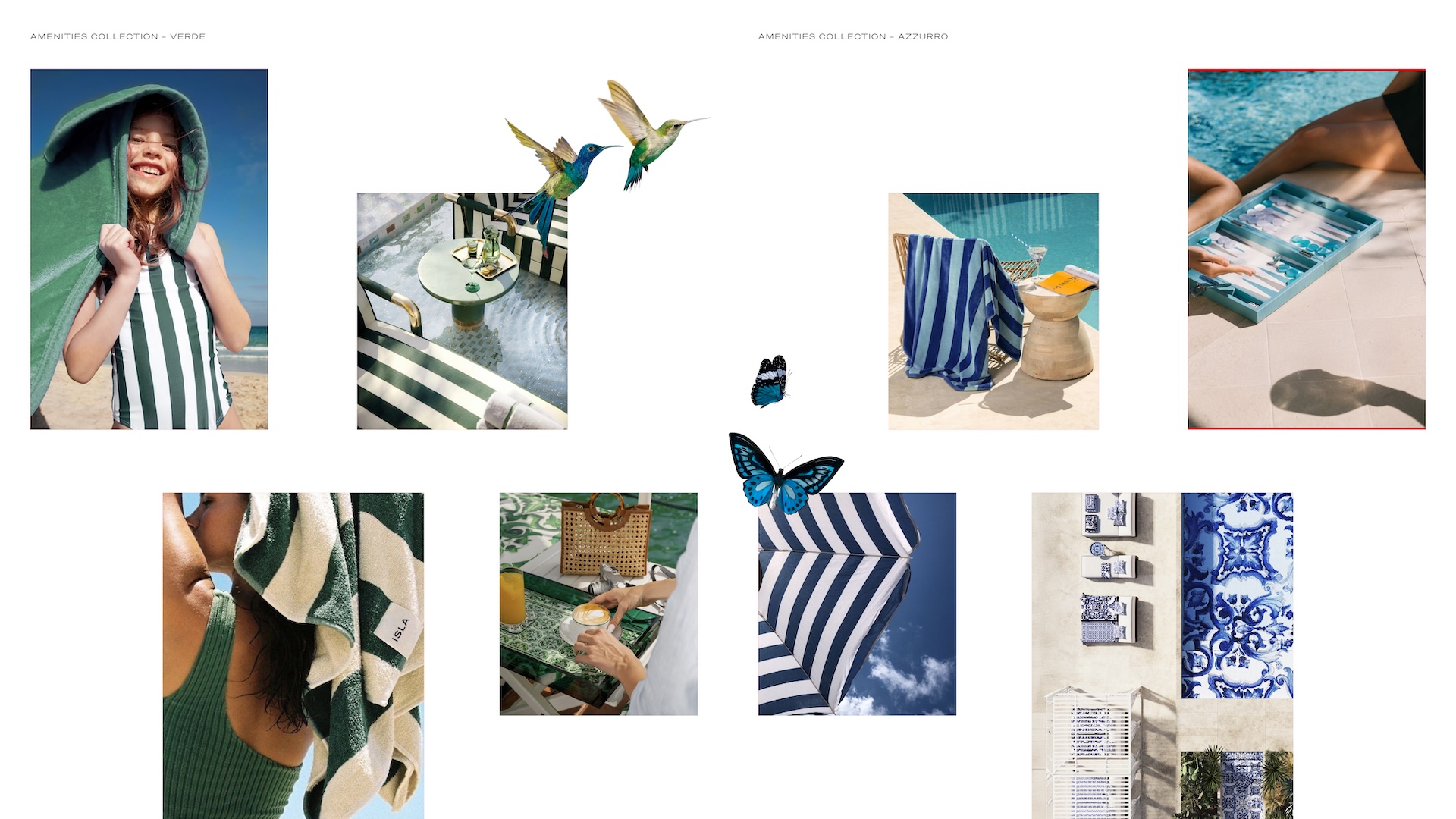
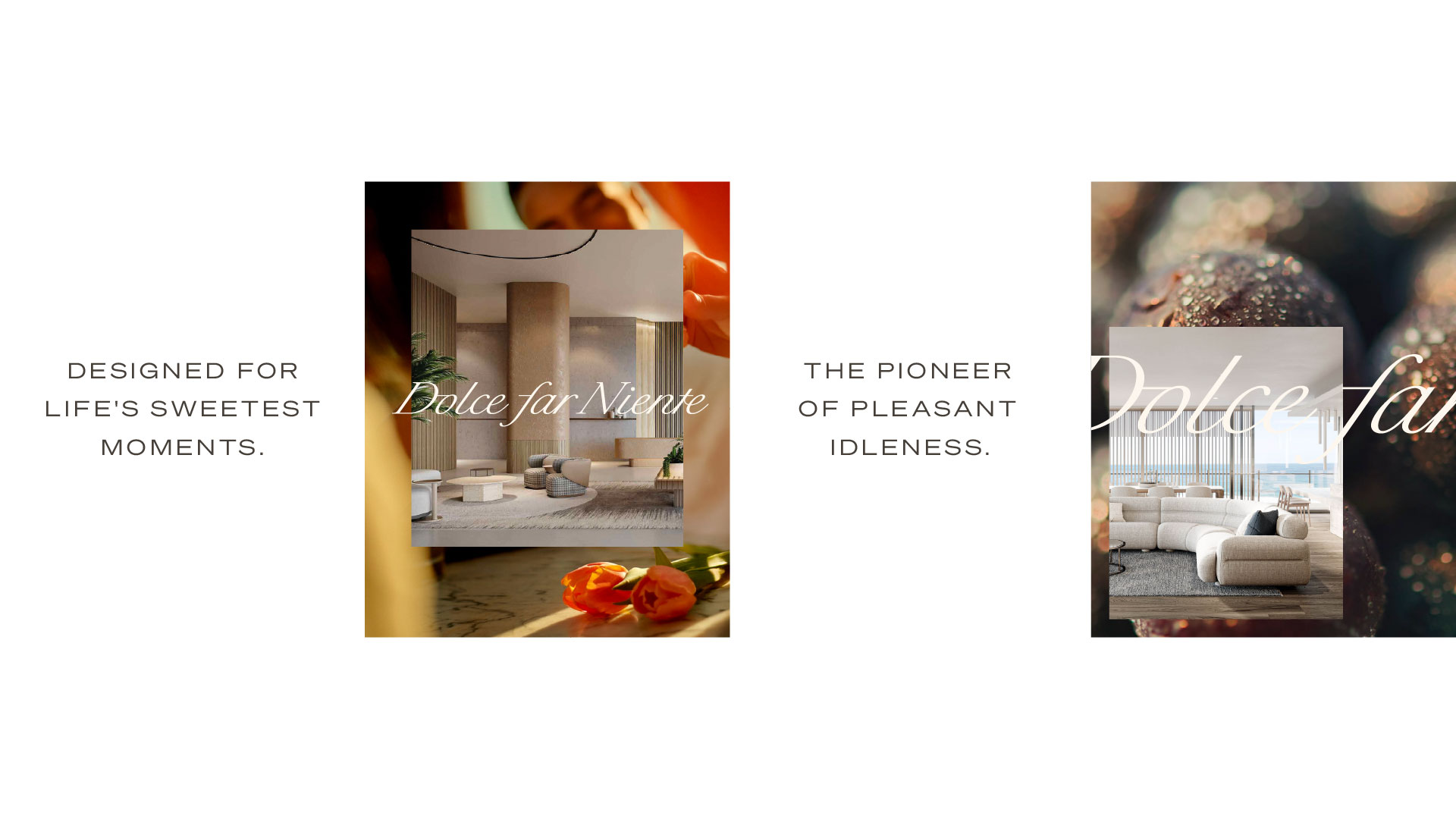
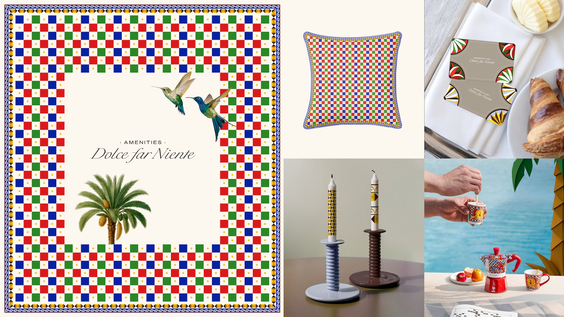
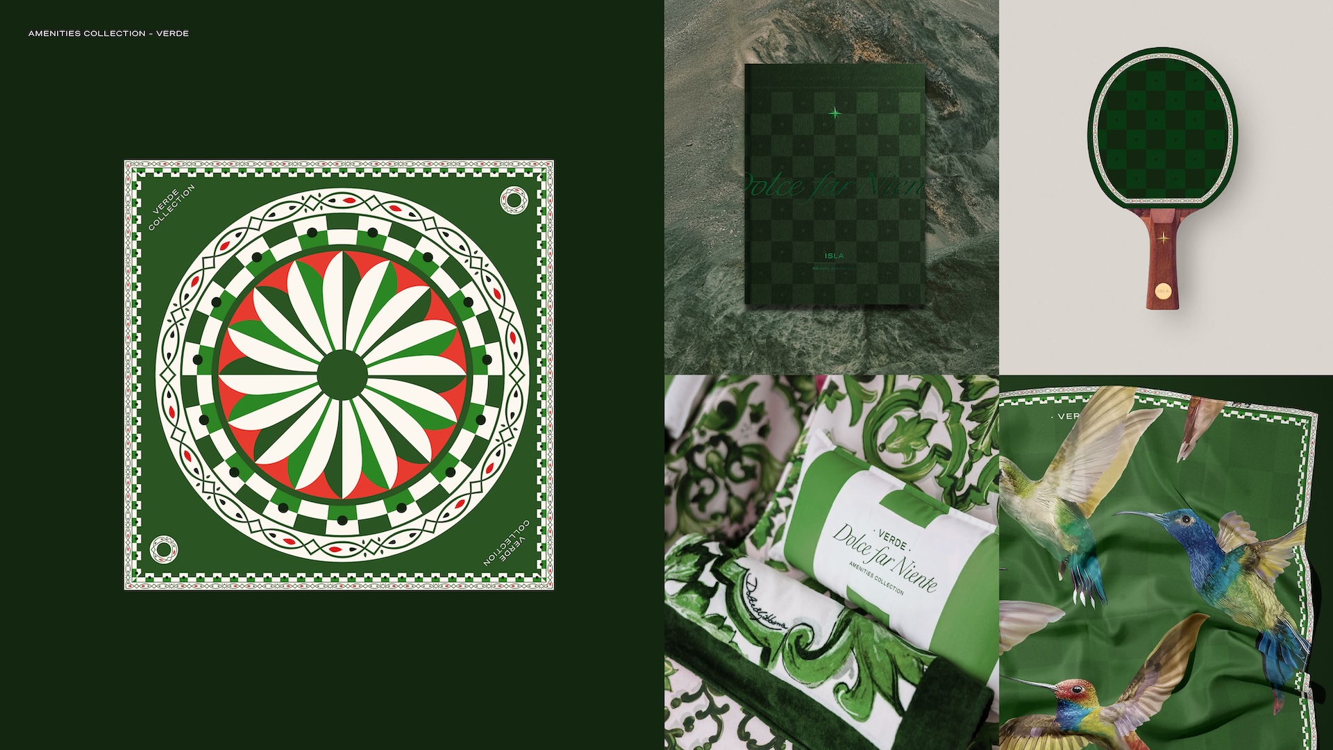
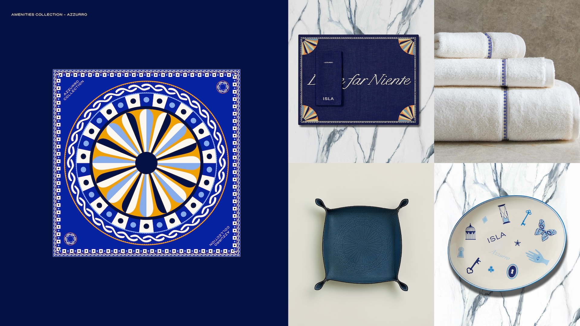
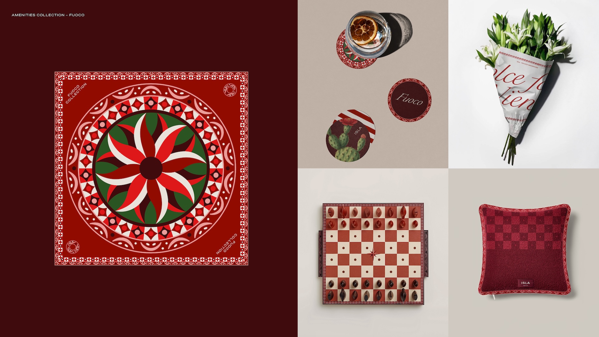
Dolce Far Niente, the Italian art of sweet idleness, translated into a Mediterranean brand world built for a Dubai audience. RUYA anchored ISLA around that single ownable idea, then carried it into The Amenities Collection, four named levels of leisure built to read like a Mediterranean itinerary rather than a floor directory: Verde, Azzurro, Fuoco and Sole. Each name did double duty, organising the building's amenities while making the brand's world legible at a glance, giving a first-time residential brand an emotional register no competing tower on Dubai Islands could claim.

BRAND DEVELOPMENT AND ECOSYSTEM
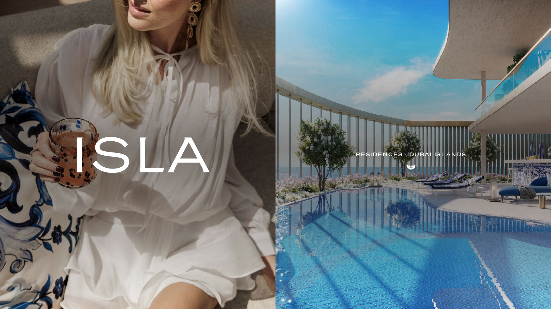
The Dolce Far Niente concept and The Amenities Collection extended into a verbal identity and tone of voice carried through every document, an ecosystem built to read as editorial rather than transactional, so ISLA felt like a lifestyle brand first and a residential tower second.
colours
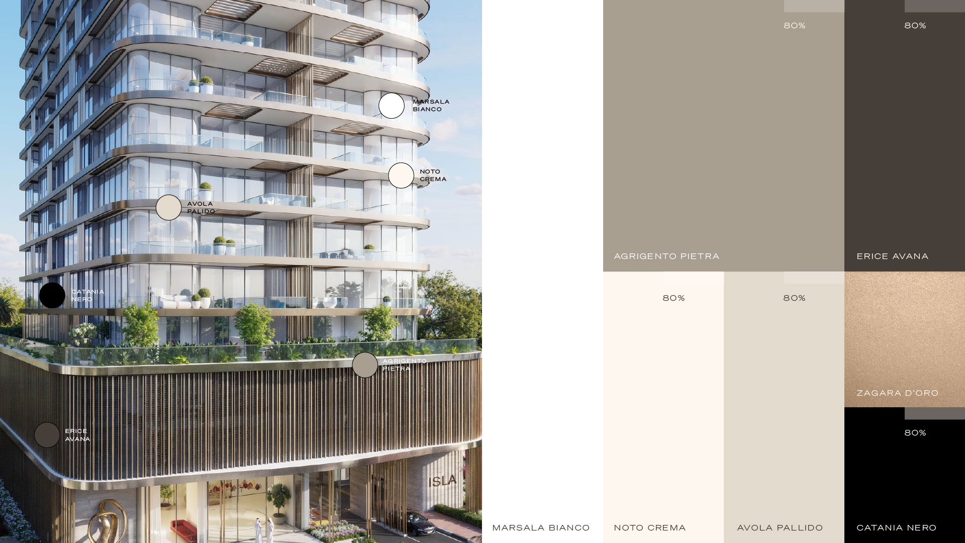
ISLA's palette is primarily led by Agrigento Pietra, soft neutrals carry the base because the wider brand is vibrant and full of life, providing a warm, composed canvas against which its livelier colours can express themselves.
typography
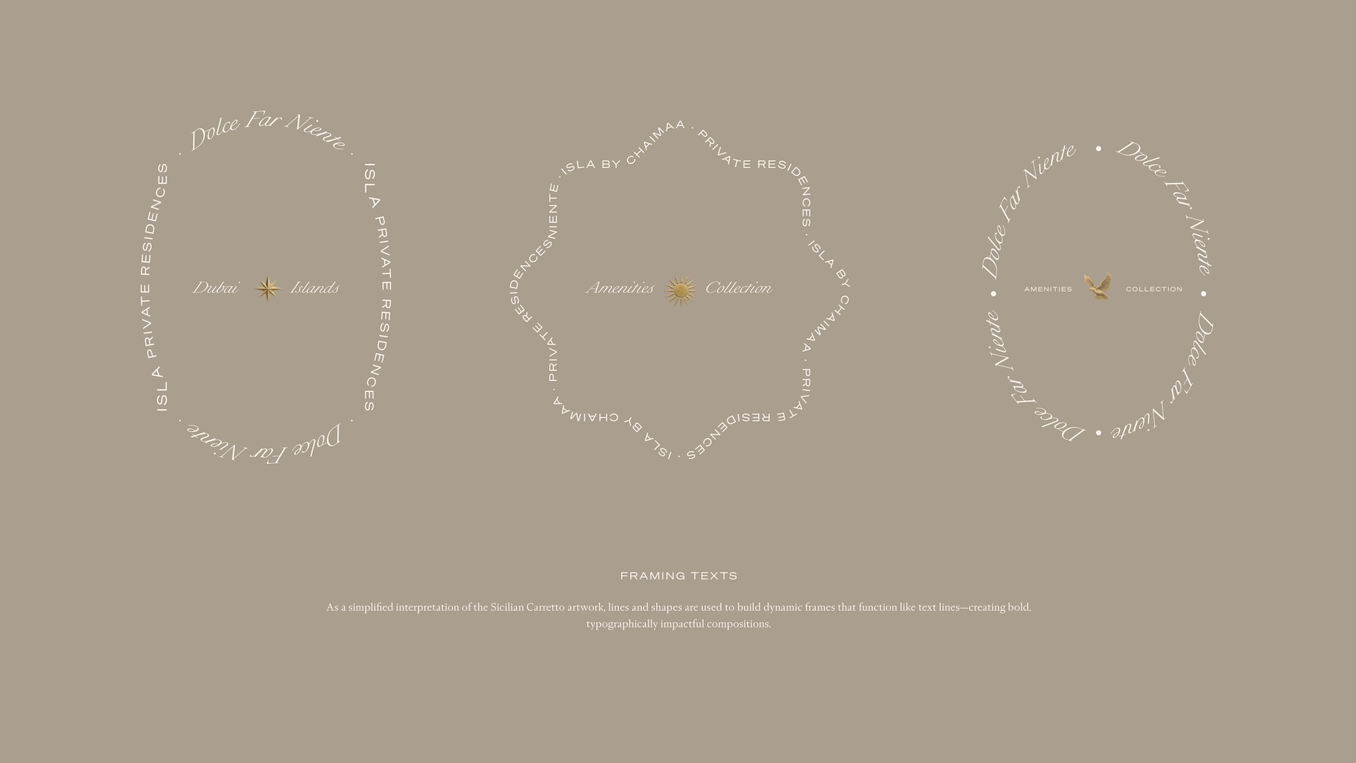
Framing texts built from these same two faces wrap the wordmark into circular and scalloped seals, naming ISLA alongside its sub-brands, Residences, Dubai Island, the Amenities Collection and Dolce Far Niente. These seals give the system a compact stamp for touchpoints where the full lockup reads too heavy, holding the same typographic voice at a smaller scale.
ICONOGRAPHY
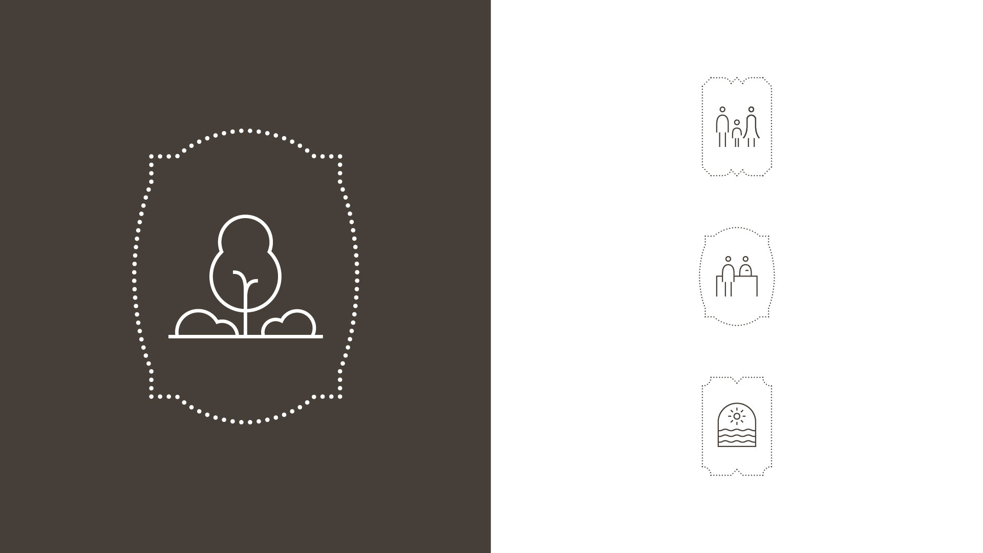
ISLA's icons are drawn in a fine, consistent line and set within the brand's dotted seal frames. They keep wayfinding and amenity touchpoints clear while staying true to the wider identity.
PHOTOGRAPHY
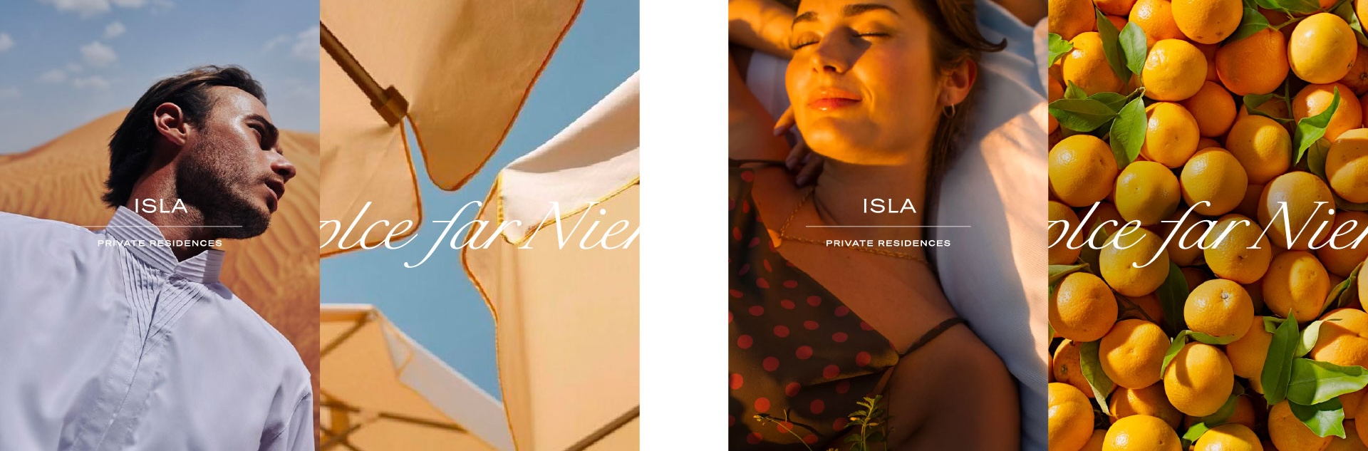
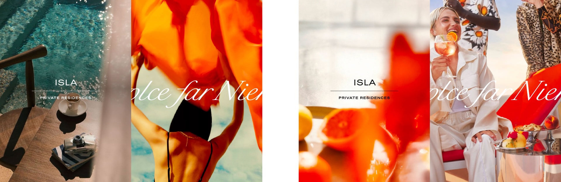
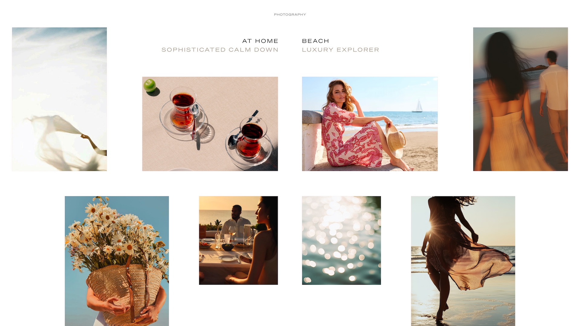
ISLA's photographic direction runs on two tracks: a curated photography bank of sourced reference imagery, and a parallel AI image library built to generate lifestyle scenes no camera could capture before a single unit existed. Custom photography was produced for each Amenities Collection so every named space carried its own visual mood rather than sharing a single generic set.Together they let the brand show sunlight, texture and idle afternoons matching Dolce Far Niente's mood.
BRAND VOICE
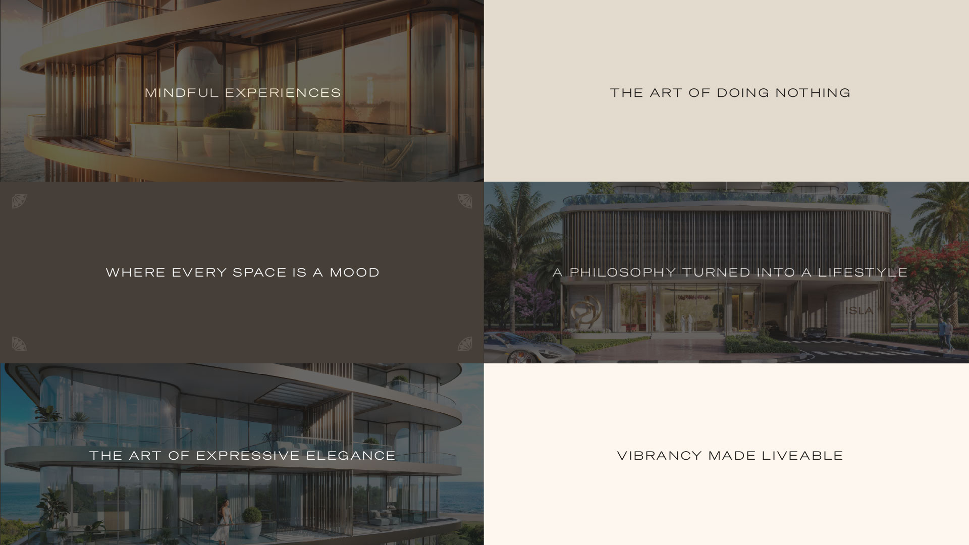
ISLA's tone is calm, assured and unhurried. Short, considered lines keep the voice warm and expressive, and true to Dolce Far Niente.
GRAPHIC RESOURCES AND BRAND EXPRESSION
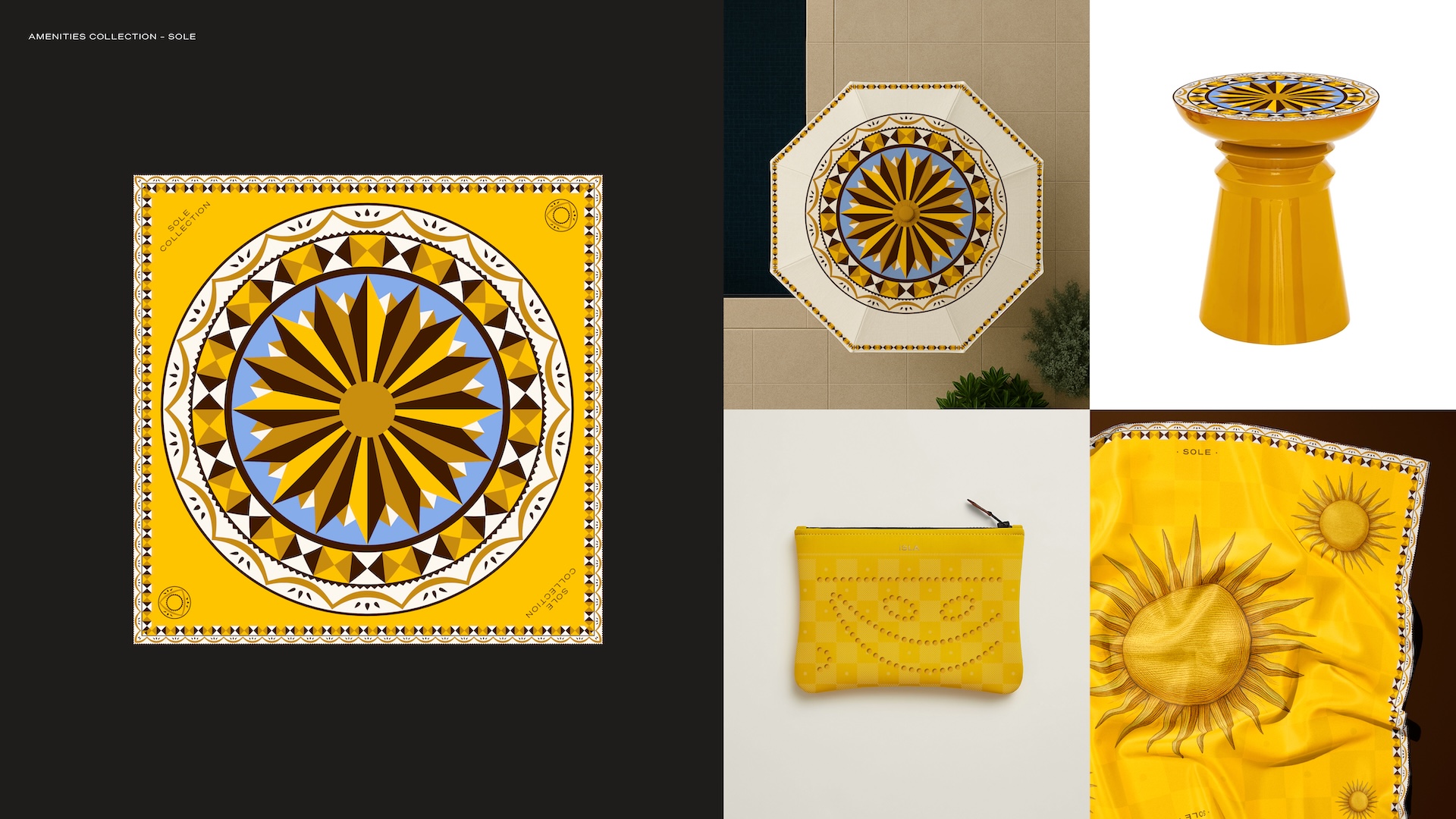
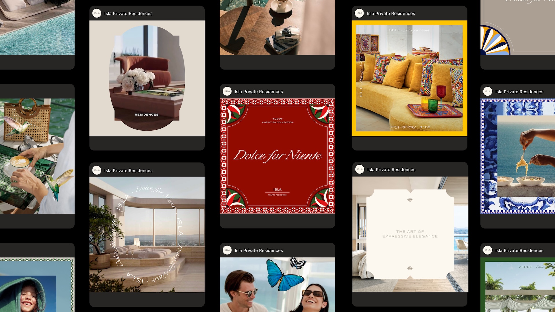
RUYA built a distinct graphic language for ISLA and for each Amenities Collection level, Verde, Azzurro, Fuoco and Sole, giving every named space its own pattern system rather than one motif stretched thin across the brand. Each set was developed as a full production library, from source artwork to export-ready assets, extending into a signature giveaway unique to that collection, a silk scarf pouch for Verde, a ceramic side table for Sole, so the language could scale from stationery to signage and gifting without losing its distinction. The result reads as layered rather than templated.
BRAND APPLICATION
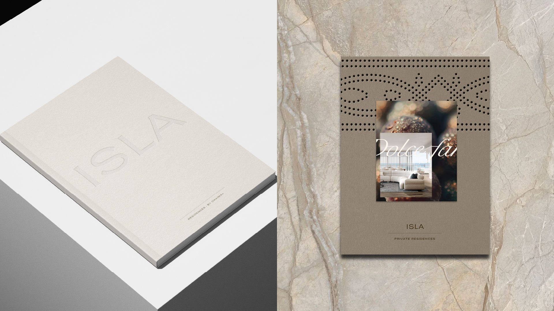
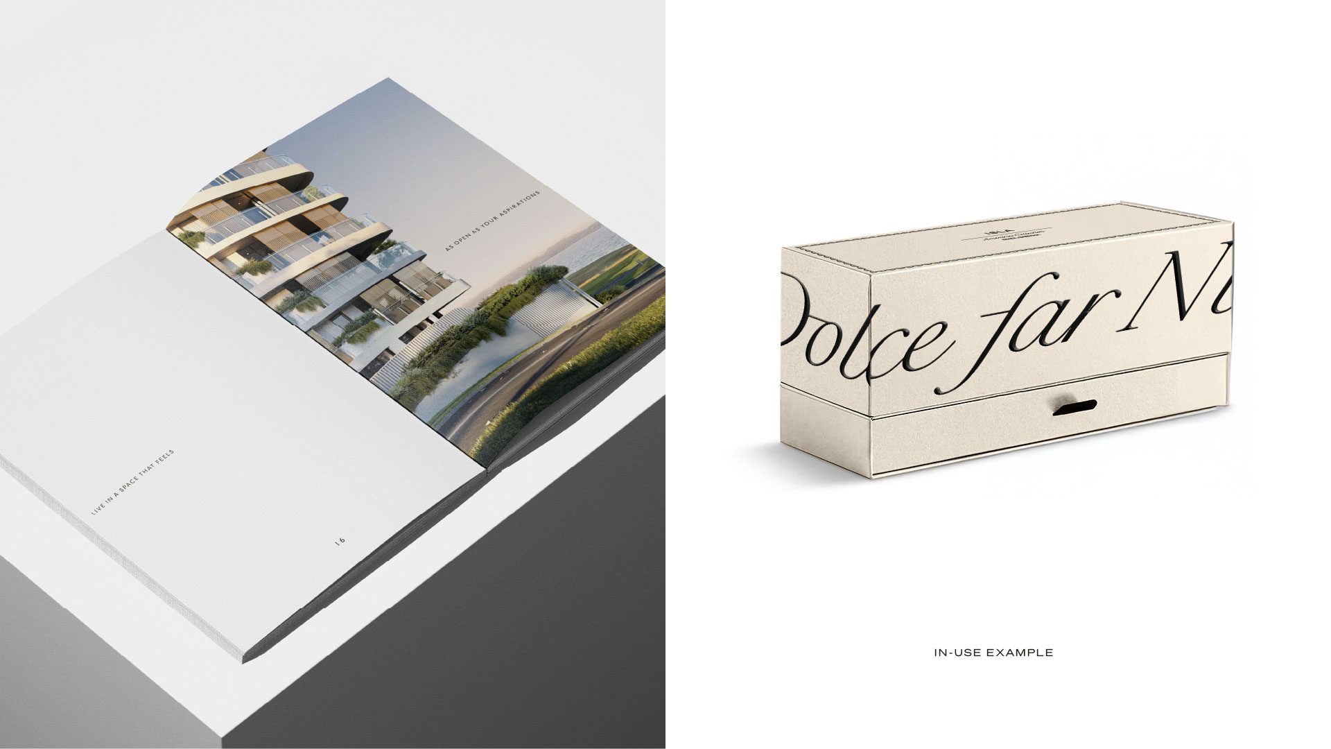
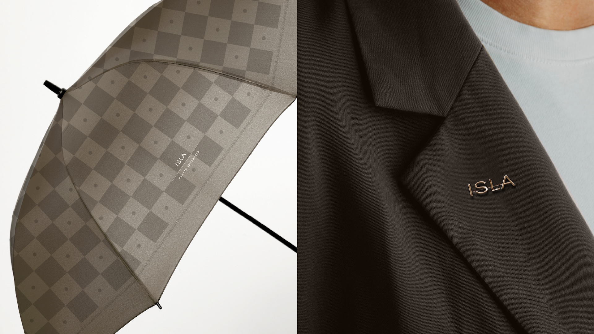
The checkered pattern and ISLA's core symbols carry from packaging and stationery into gifting boxes, brochures, uniforms and even an umbrella. Every physical touchpoint, from an embossed lapel pin to a perforated brochure cover, reads as one considered system rather than separate collateral.
DIGITAL APPLICATION
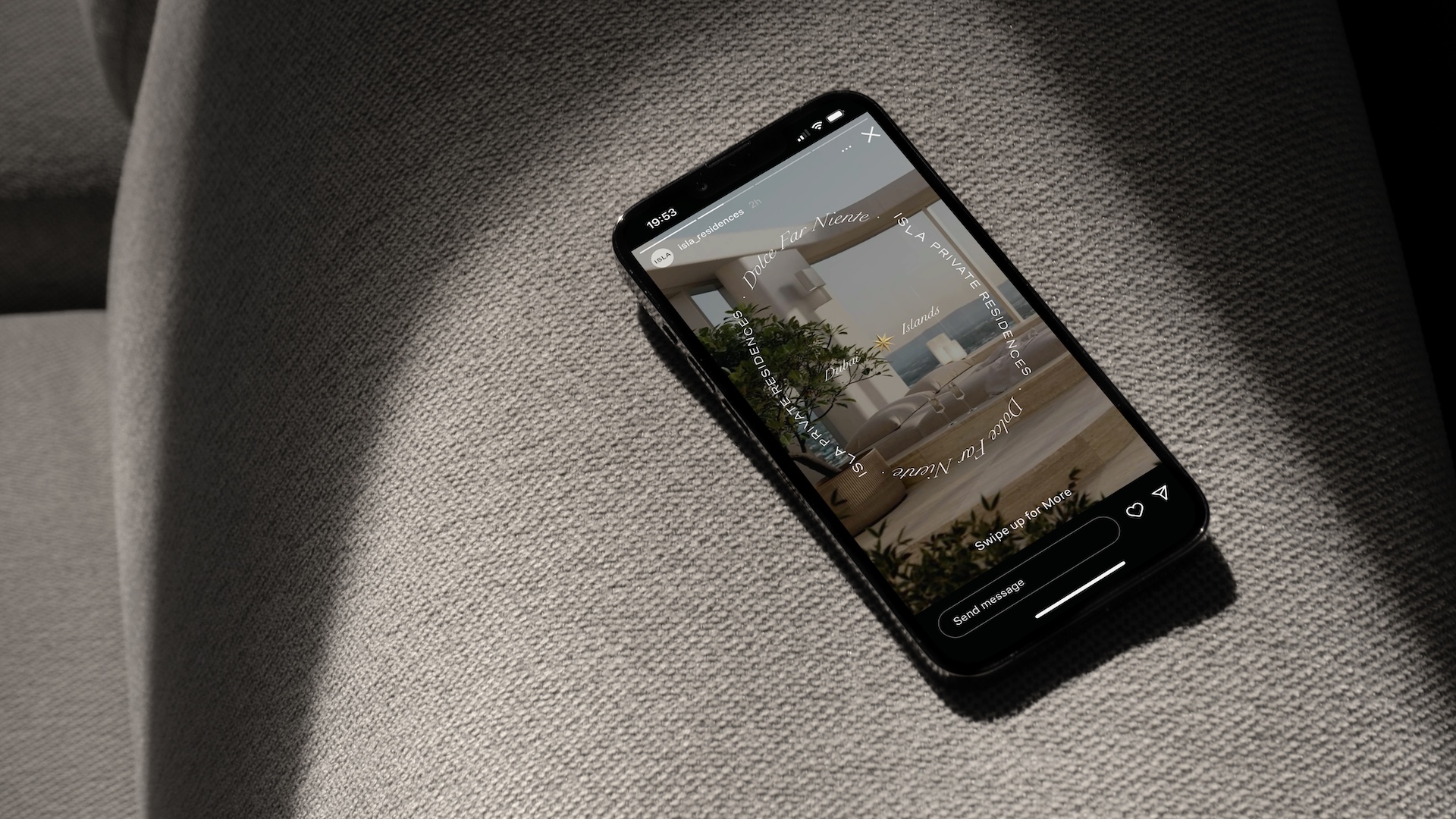
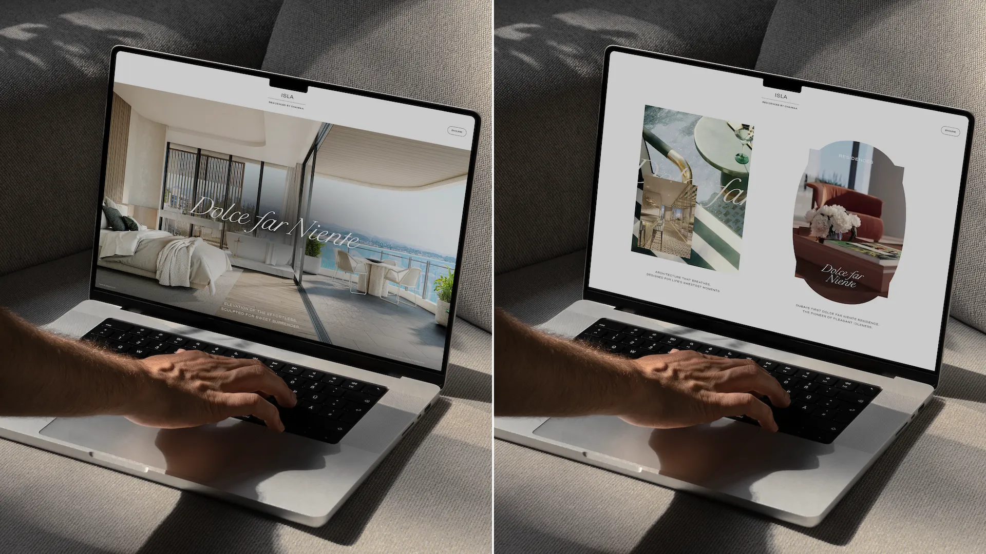
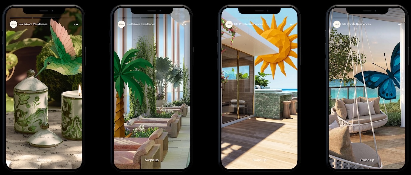
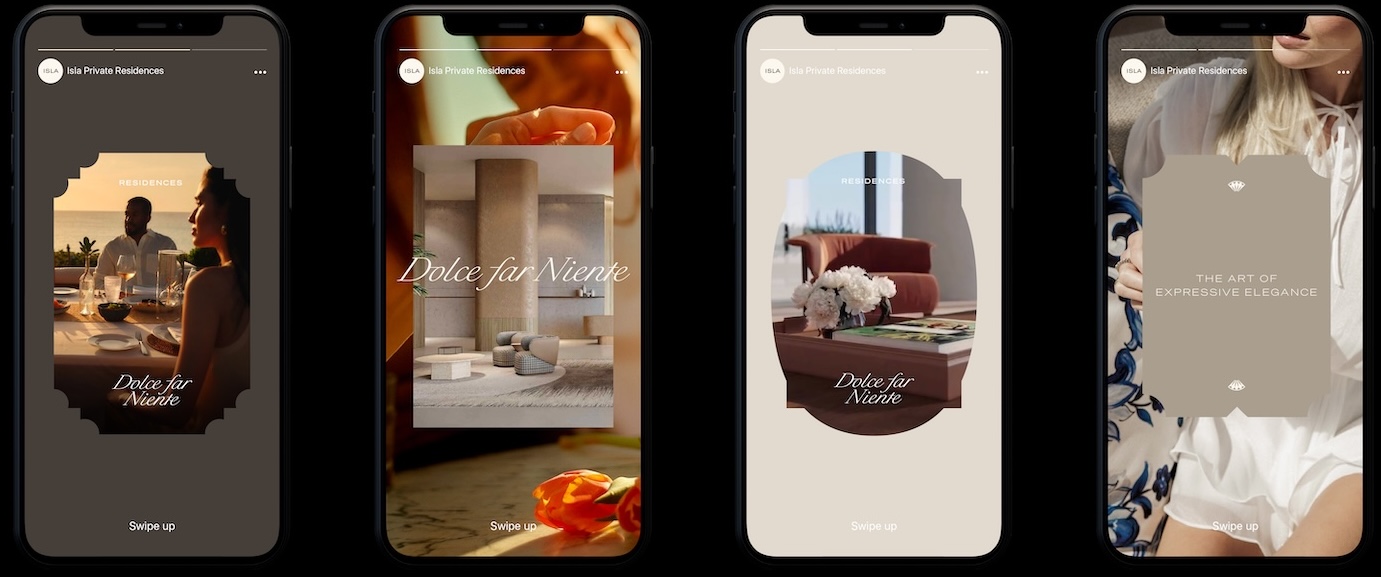
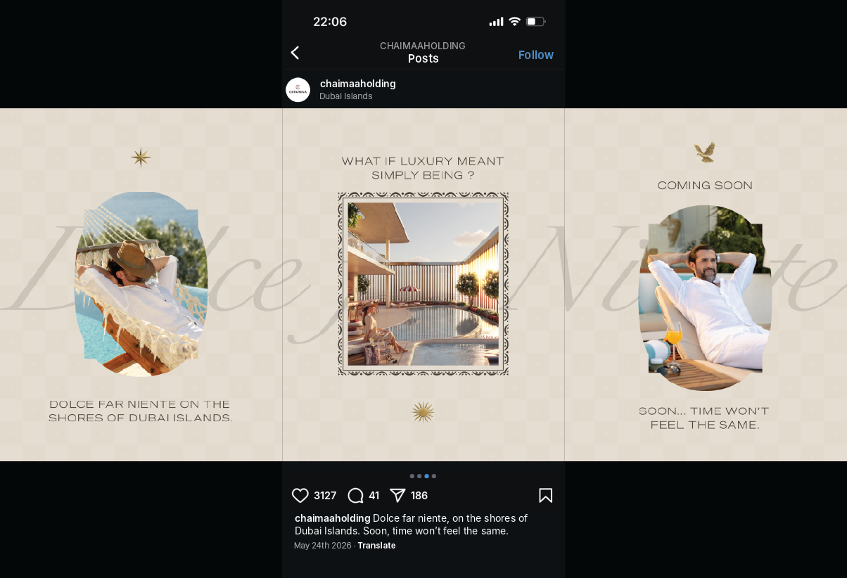
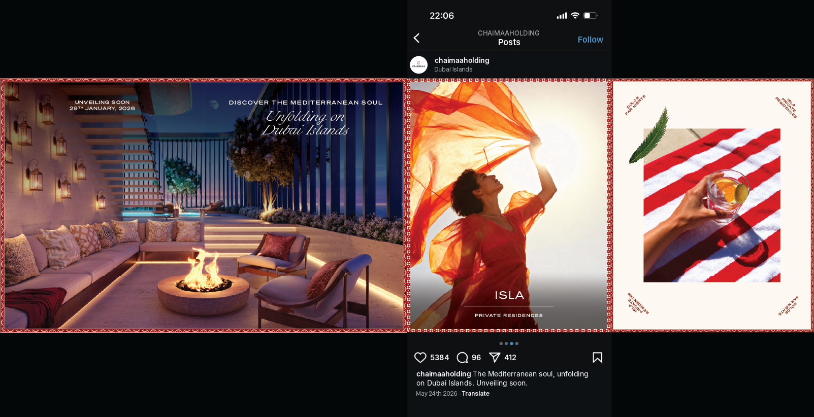
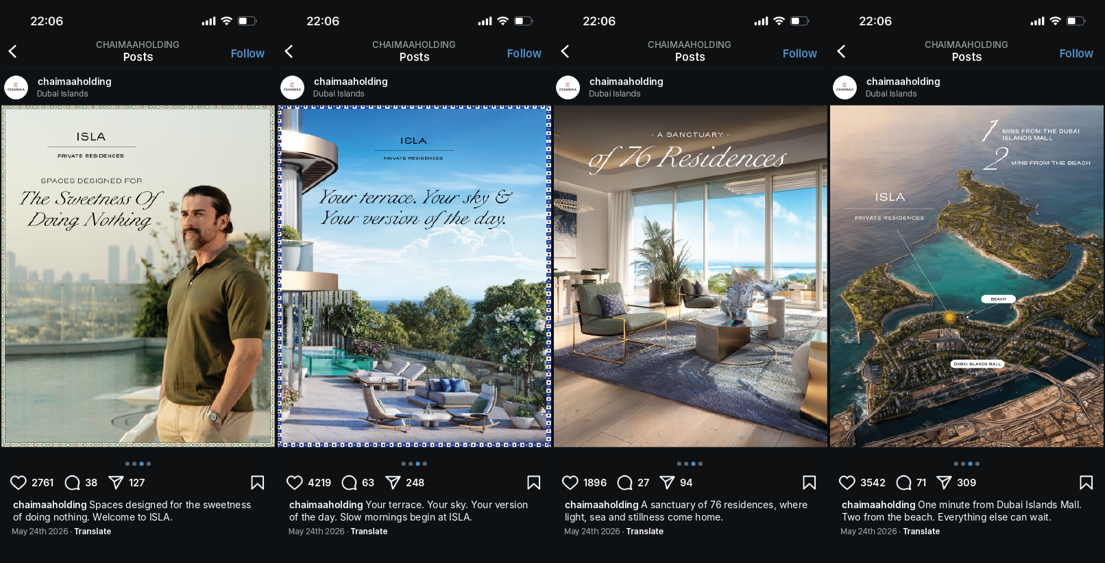
Scroll past ISLA on a phone screen and the same world reassembles itself, a website, a story, a single square post, each one a different frame on one identity. The brand does not shrink for digital. It simply finds a new surface to inhabit.
3D VISUALIZATION & CGI
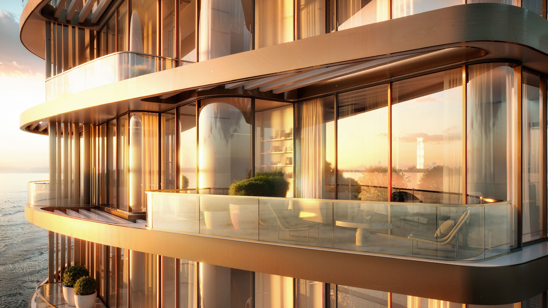
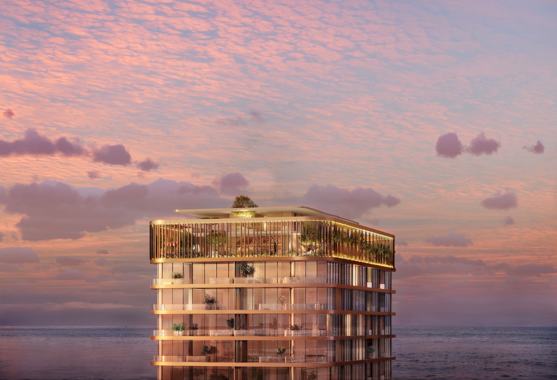
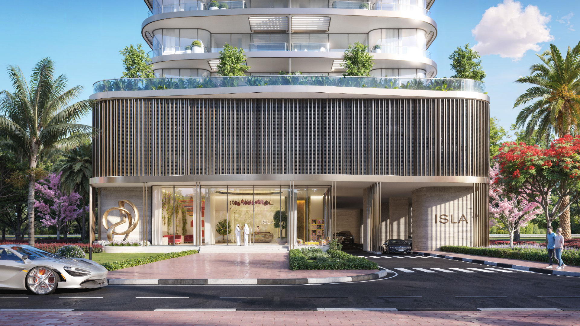
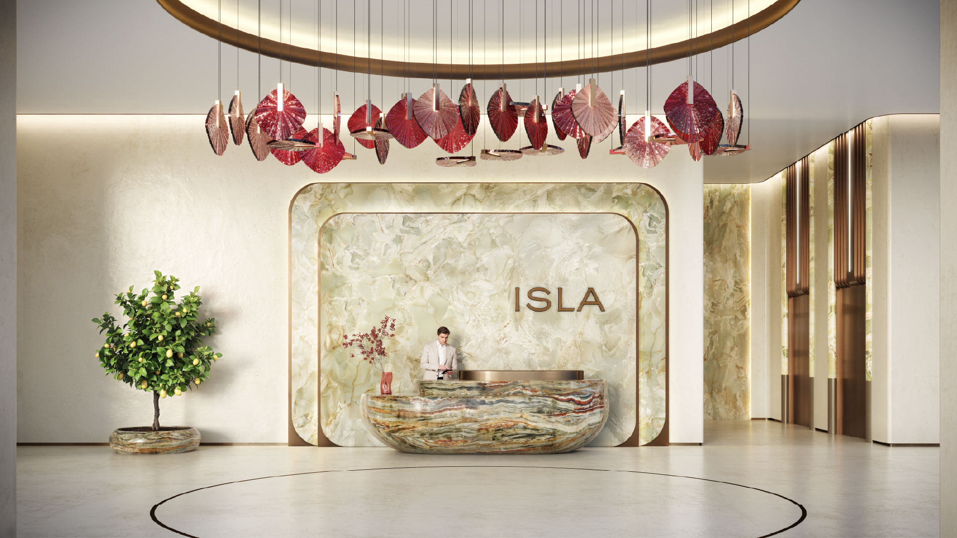
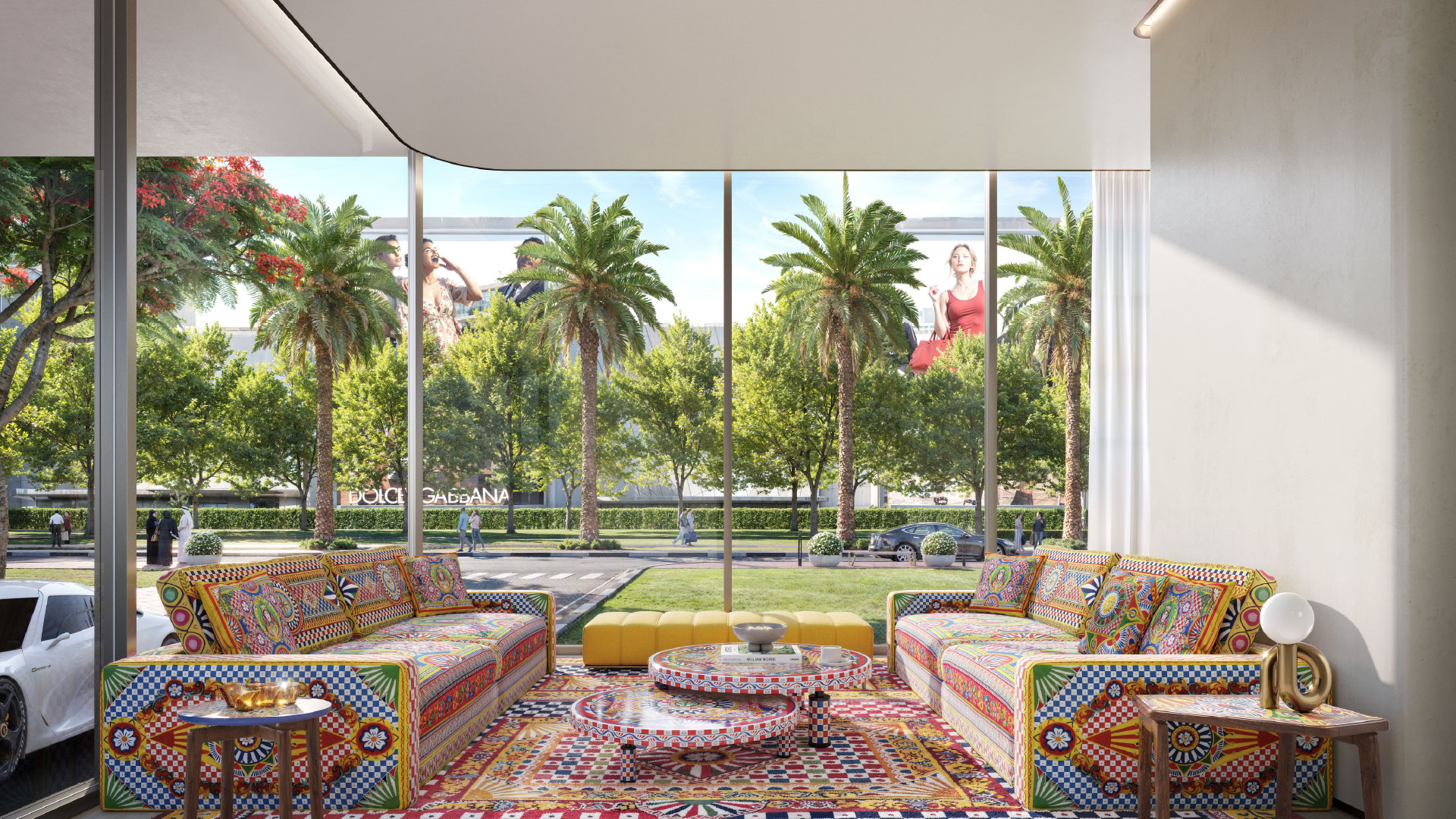
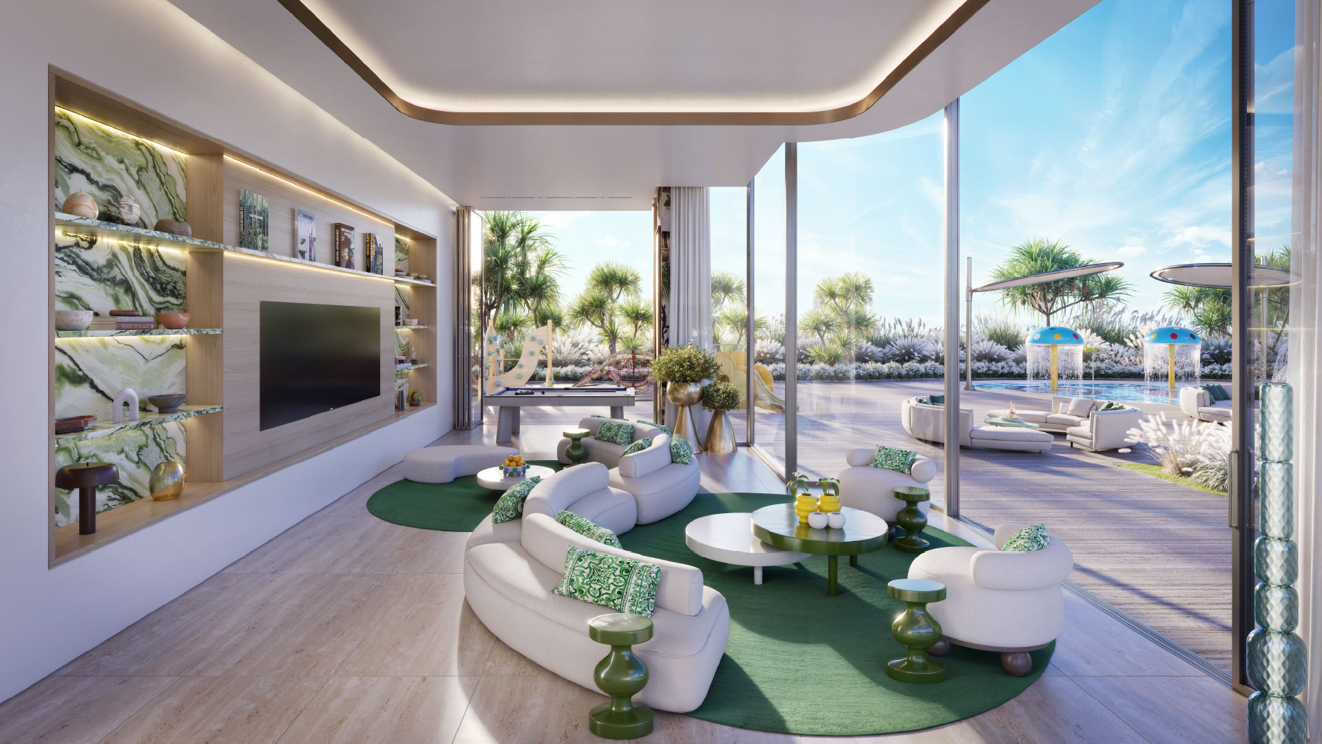
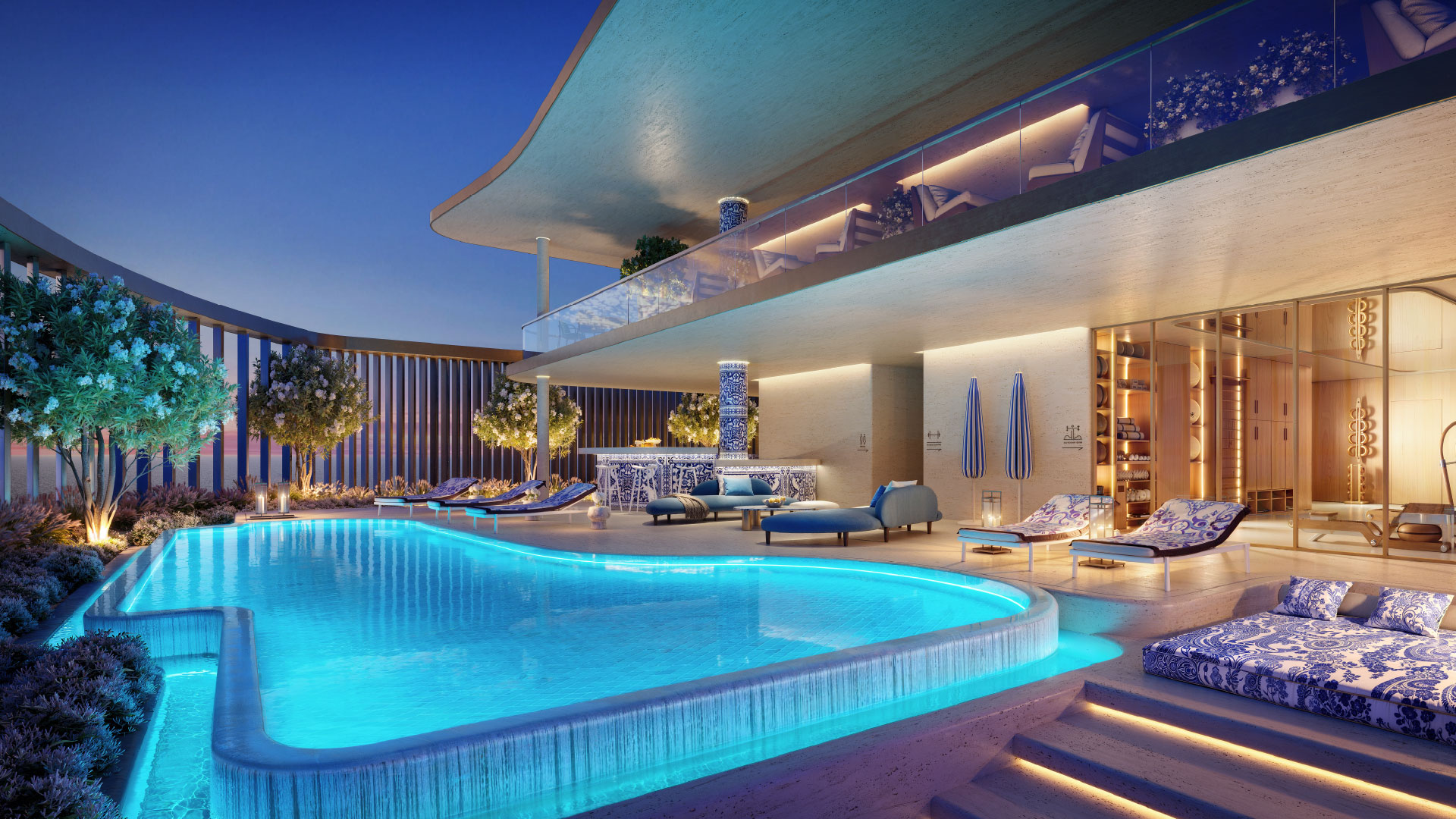
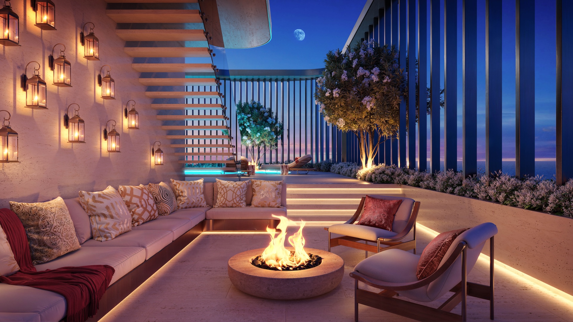
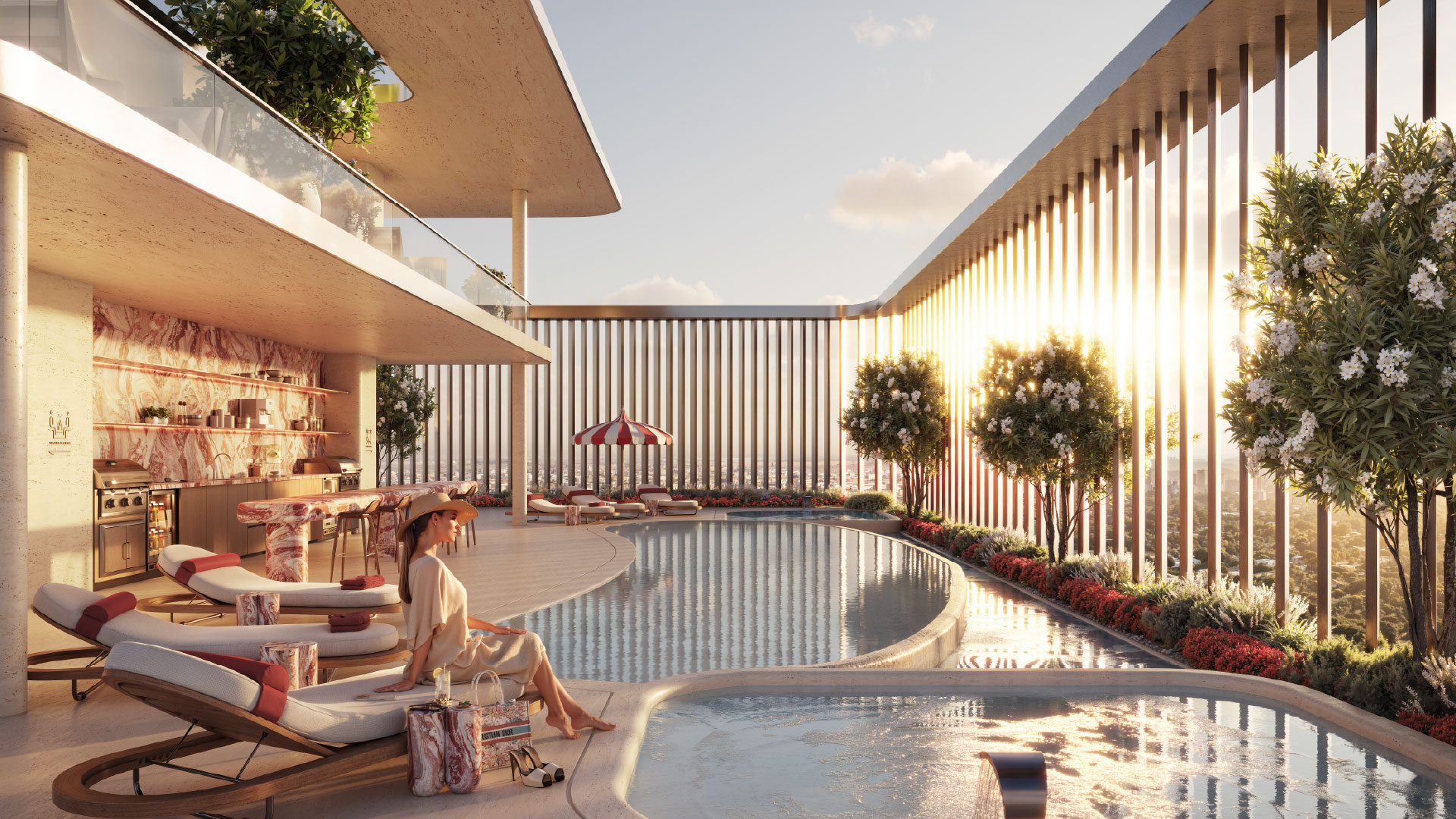
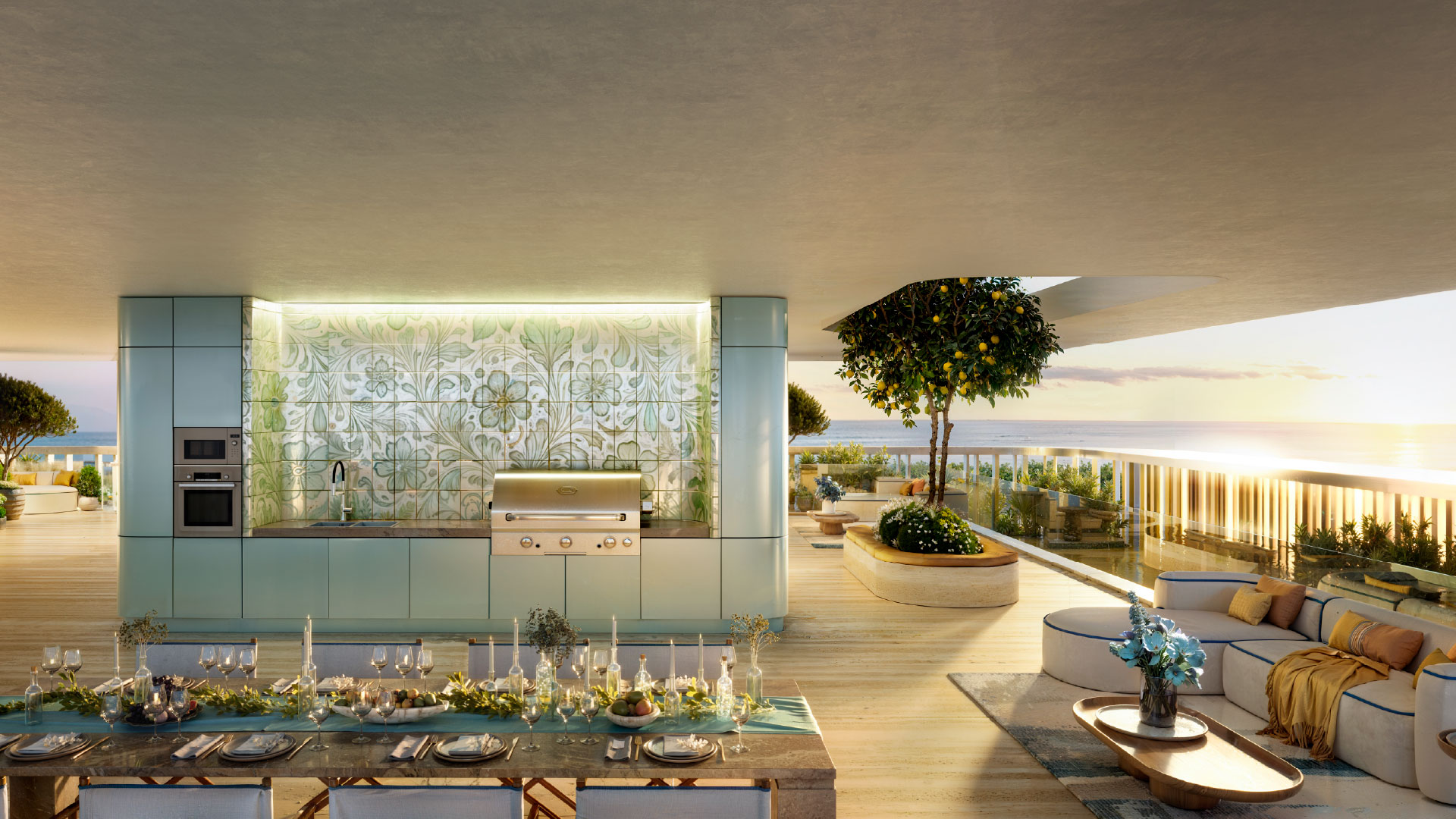
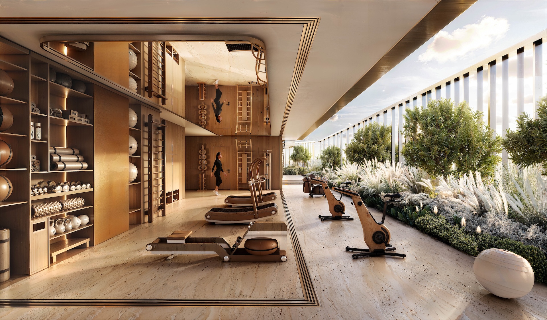
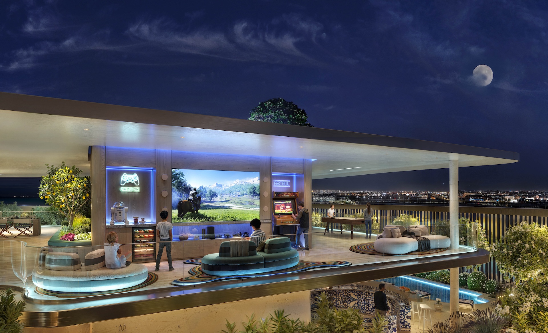
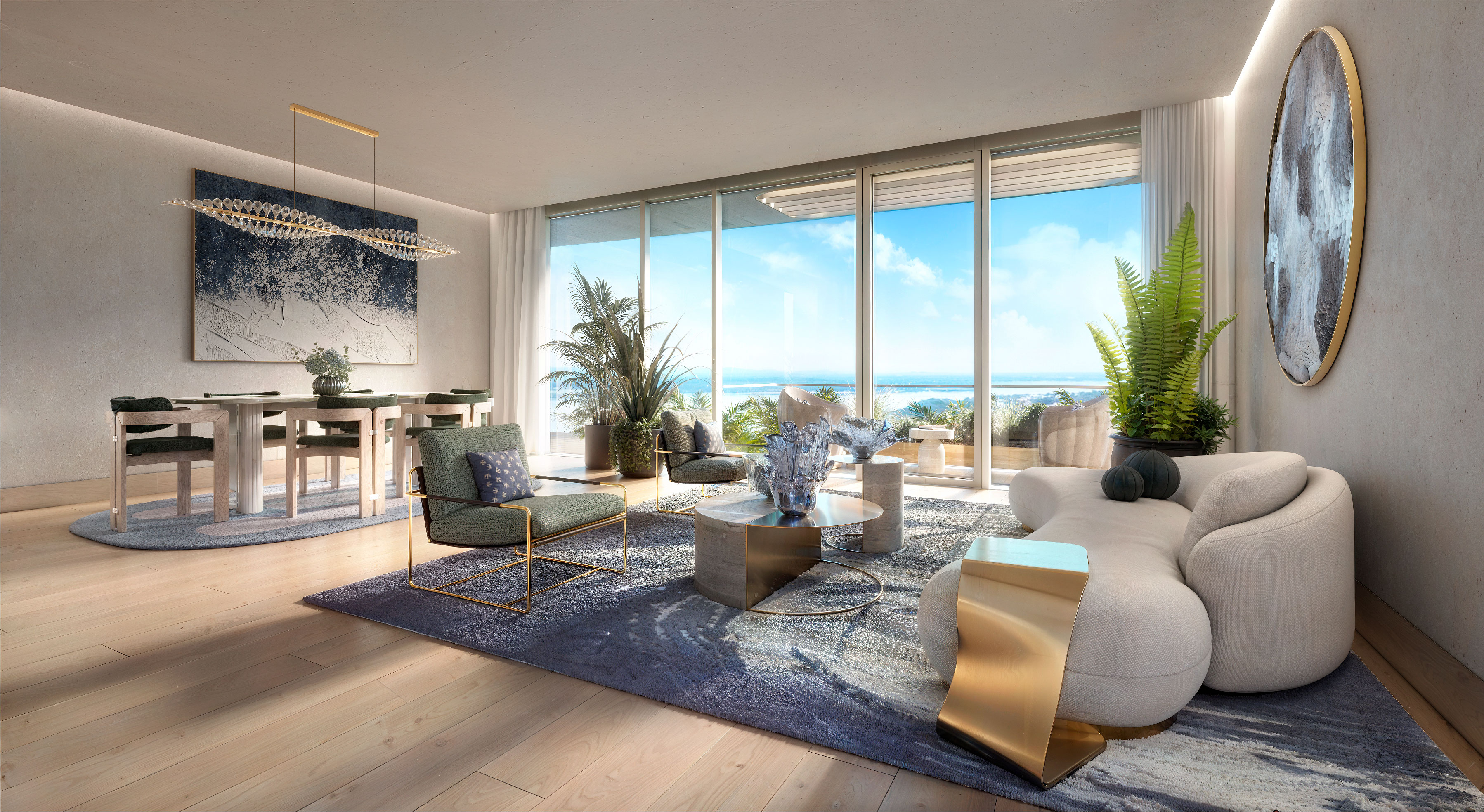
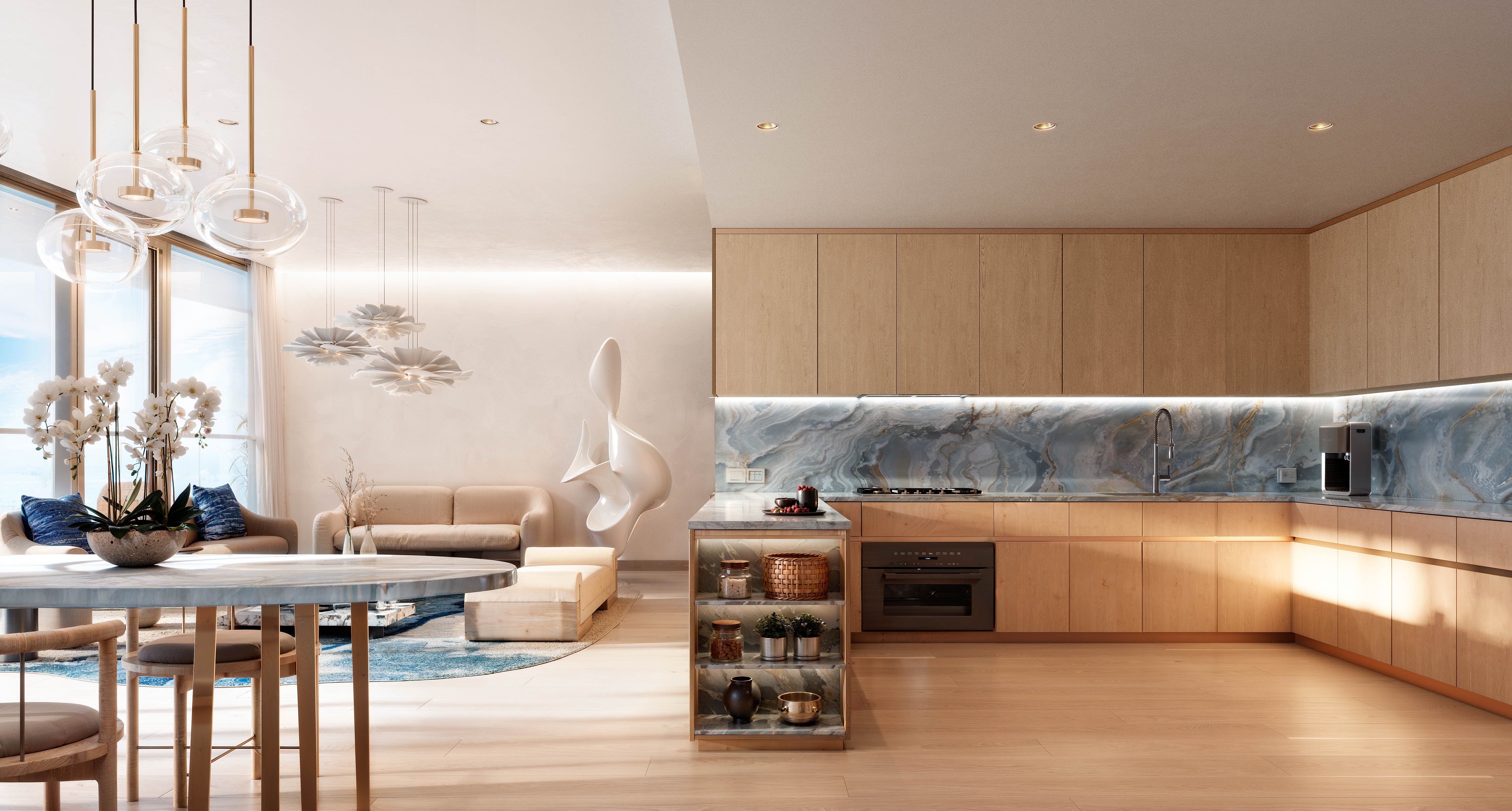
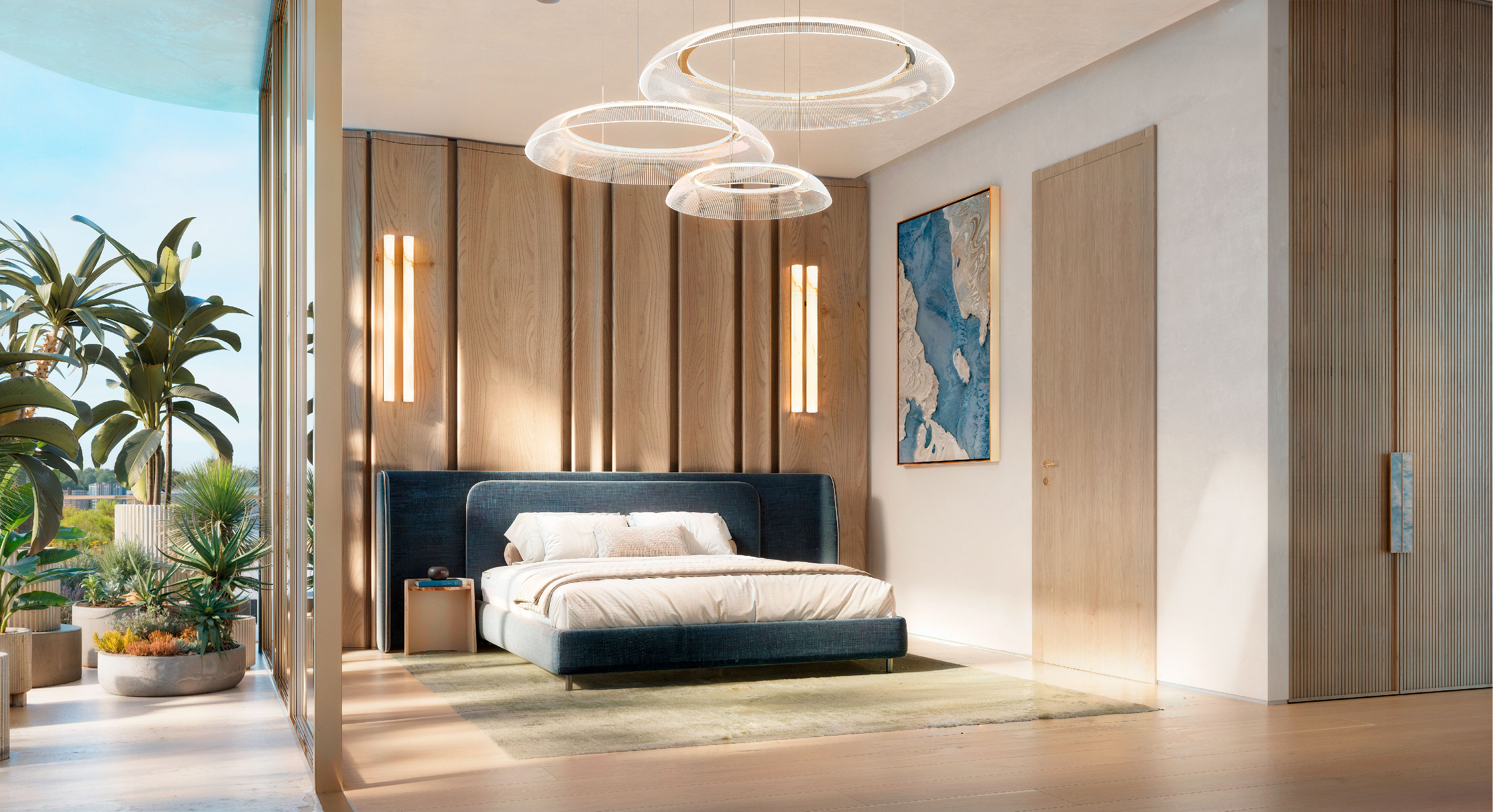
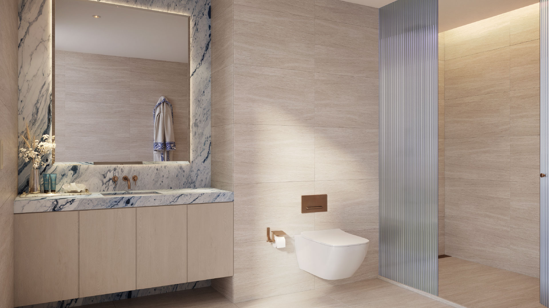
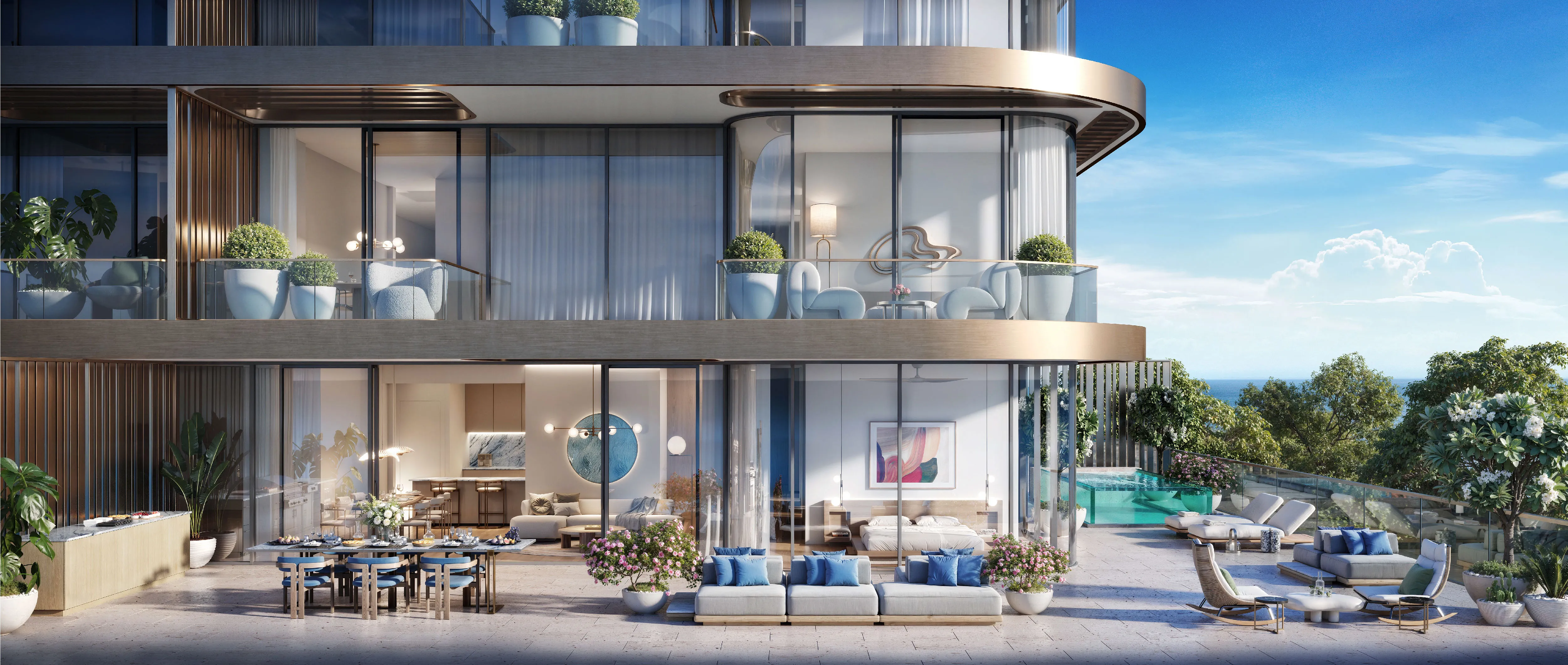
RUYA art directed the render pipeline end to end, briefing camera angles, lighting studies and material callouts before a single frame went to render, then reviewing every pass across exteriors, amenities, interiors and cinemagraphs until each one held brand consistent, photorealistic. What launched didn't read as CGI. It read as photography of a building not yet standing.
EXECUTION AND LAUNCH
RUYA ran ISLA's go-to-market on two levels. A refreshed Chaimaa.ae carried the corporate announcement, positioning ISLA within Chaimaa Holding's portfolio. The project campaign unfolded in three phases. Teaser introduced Dolce Far Niente through social content and a teaser brochure, ahead of naming the destination. Pre-launch built anticipation via EDMs, WhatsApp broadcasts and social content, closing with a video invitation fronted by Cengiz Coşkun. Launch delivered the full suite: launch and event films, bilingual brochures, a website film, sales presentation, factsheet, floor plans, digital brochure and payment plan, backed by further EDMs and social content.
the results

Luxury Real Estate
Piramal Mahalaxmi

Corporate
Osus

Hotels & Resorts
Nurai Island
